Efficiency Report
Use the Efficiency report to demonstrate operational savings, measure alert-management efficiency, and communicate Return on Investment (ROI) from Virtana to stakeholders. It shows how much operational time your organization saves by using Virtana to detect, correlate, and resolve alerts. The report compares a baseline that you define the time you spent managing alerts before you adopted Virtana against Virtana's current performance. It summarizes your monitored assets, utilization, and alert volume on a single page.
Overview
To open the Efficiency report, click Reports in the Global View left navigation menu, and then select Efficiency. The report opens as a single page of panels. The page header shows when the report last synchronized with your data and how often it refreshes. For example, it might display Last synced 25 minutes ago (Frequency: every 1 hour).
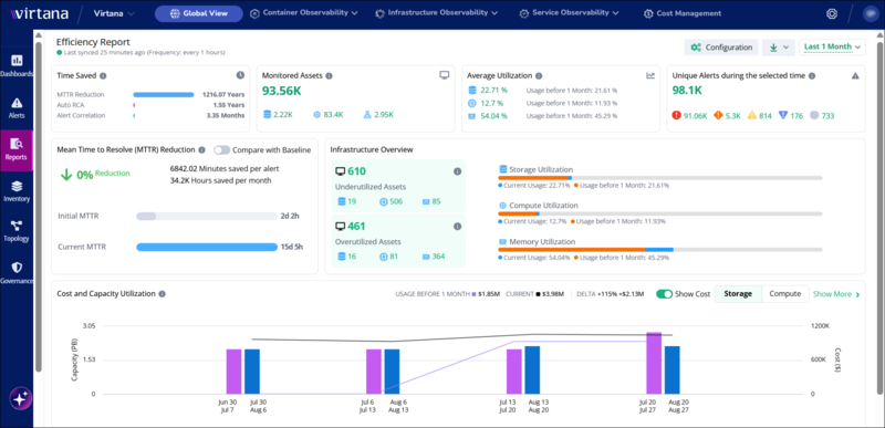
The Efficiency report page shows the Time Saved, Monitored Assets, Average Utilization, and Unique Alerts panels across the top row, the Mean Time to Resolve (MTTR) Reduction and Infrastructure Overview panels in the second row, and the Cost and Capacity Utilization chart at the bottom. These panels give you a unified view of the business value Virtana delivers, from time saved and alert efficiency at a glance, to deeper insight into how quickly incidents are resolved and where infrastructure is over- or under-utilized. Together, they can help you to justify tooling investment, optimize resource allocation, and make confident decisions about cost and capacity, all from a single report.
Report options
Four options in the report header change what the report shows and how you export it. The options apply to the whole page, not to individual panels. The following table describes each control:
Option | Description |
|---|---|
Compare with Baseline | Switches the Mean Time to Resolve (MTTR) Reduction panel between two comparisons. When the toggle is on, the panel compares current performance against the baseline you configured. When the toggle is off, the panel compares the current period against the preceding period of the same length. |
Configuration | Opens the Return on Investment Baseline Configuration dialog, where you enter the baseline values for your environment. |
Download | Exports the report. Select PDF Document to download the current view as a PDF file. |
Time range selector | Sets the reporting period. The available options are Last 1 Month, Last 3 Months, Last 6 Months, Last 9 Months, and Last 12 Months. |
Report panels
In the Efficiency report, you can view data across seven panels. The Time Saved, Monitored Assets, and Mean Time to Resolve (MTTR) Reduction panels show the time and effort your organization saves. The remaining panels provide supporting infrastructure and alert context. The following table describes the information that each panel reports:
Panel | Description |
|---|---|
Time Saved | Total operational time saved in the selected period, broken into three rows: MTTR Reduction, Auto RCA (automated root cause analysis), and Alert Correlation. Each row shows the savings in the largest sensible unit, such as years or months. |
Monitored Assets | The average number of assets Virtana monitored during the selected period, with a breakdown by storage, compute, and network assets. |
Average Utilization | Current average storage, compute, and memory utilization, each shown next to the value for the preceding period. Select a utilization value to open a side panel with per-asset detail. |
Unique Alerts during the selected time | The count of unique alerts in the selected period, with a breakdown by severity: critical, major, warning, minor, and unknown. Select a severity count to open the Alerts page filtered to that severity. |
Mean Time to Resolve (MTTR) Reduction | The percentage reduction in mean time to resolve (MTTR), the minutes saved per alert, and the hours saved per month. The panel also shows two progress bars that compare the baseline or initial MTTR against the current MTTR. |
Infrastructure Overview | Counts of underutilized and overutilized assets by asset type, alongside storage, compute, and memory utilization bars that show current usage against the value for the preceding period. |
Cost and Capacity Utilization | A chart that compares capacity utilization, and optionally cost, for the current period against the equivalent preceding period. Use the Storage and Compute tabs to switch resource type, and the Show Cost toggle to show or hide the cost lines. |
Baseline configuration window
The Return on Investment Baseline Configuration window collects the five values that define your baseline. Virtana uses these values in the Time Saved and MTTR Reduction panels whenever Compare with Baseline is on.
Set the baseline before you share the Efficiency report, because the Time Saved and MTTR Reduction panels calculate their results from it. Have your baseline figures ready before you start: average time to resolve one alert, monthly alert volume, and average hours per alert for manual root cause analysis (RCA), alert correlation, and remediation.
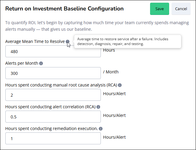
The Return on Investment Baseline Configuration window shows five input fields for average mean time to resolve, alerts per month, manual RCA hours, alert correlation hours, and remediation execution hours, with Save and Cancel buttons.
View the following table to learn how to set the baseline configuration for your organization:
Field | Unit | Description |
|---|---|---|
Average Mean Time to Resolve | Hours | The average time your team took to restore service after a failure, including detection, diagnosis, repair, and testing. Enter the value in hours; for example, enter |
Alerts per Month | Alerts per month | The average number of alerts your team handled each month before you adopted Virtana. |
Hours spent conducting manual root cause analysis (RCA) | Hours per alert | The average time your team spent identifying the root cause of one alert manually. |
Hours spent conducting alert correlation (RCA) | Hours per alert | The average time your team spent determining that separate alerts shared a root cause. |
Hours spent conducting remediation execution | Hours per alert | The average time your team spent applying the fix for one alert, after identifying the root cause. |
Note
Compare the value you enter in Alerts per Month with the count in the Unique Alerts during the selected time panel. If the two figures are close, the report's time-saved calculation reflects your environment accurately. A large gap indicates that Virtana detects far more alerts than your baseline assumes, which is itself a useful finding to discuss with your Virtana account team.
Compare Efficiency report data with your baseline
Use the Compare with Baseline toggle to switch the MTTR Reduction panels between a baseline comparison and a period-over-period comparison. The toggle doesn't change the other five panels on the Efficiency report. Monitored Assets and Unique Alerts during the selected time report current measured values, and Average Utilization, Infrastructure Overview, and Cost and Capacity Utilization always compare against the preceding period.
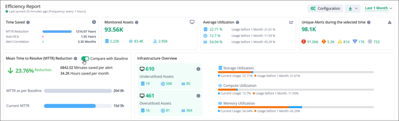
Turn on Compare with Baseline. In the MTTR Reduction panel, the first progress bar is labeled MTTR as per Baseline and shows the value you entered in the baseline configuration. The remaining panels are unaffected and continue to compare against the preceding period.
Turn off Compare with Baseline to compare against the preceding period instead. The panel labels the first progress bar Initial MTTR and shows the mean time to resolve (MTTR) for the preceding period. Comparison labels name the equivalent preceding interval, for example, Usage before 1 Month when the reporting period is Last 1 Month.
Drill down from the Efficiency report
Drill down from the Efficiency report when you need the detail behind a summary value, such as the specific alerts that contribute to a mean time to resolve (MTTR) figure. The Efficiency report summarizes data for high-level review, so the drill-down targets are the existing Virtana dashboards rather than views inside the report itself. You can drill down in the following ways:
To open the alert detail, select a severity count in the Unique Alerts during the selected time panel. The Alerts page opens with the corresponding severity tab preselected.
To open the asset detail for a utilization value, select the value in the Average Utilization panel. A side panel opens with the total capacity, used capacity, and utilization percentage for each asset, in the same format as the storage and compute cost and capacity dashboards.
To open the asset detail for a point in the capacity chart, select the data point in the Cost and Capacity Utilization panel. The Utilization side panel opens for the selected interval.
Note
Alert counts in the Unique Alerts during the selected time panel can differ from the counts on the Alerts page for two reasons. The panel counts each alert once regardless of how many times the alert repeats, and the report aggregates alert data on a fixed synchronization schedule, so the two figures can drift between synchronizations.
Understanding efficiency report calculations
Each panel on the Efficiency report derives its value from measured Virtana data, from the baseline you configure, or from both. Understanding the derivation helps you explain the figures to stakeholders and set the baseline accurately.
Monitored assets
The Monitored Assets panel shows the average number of assets Virtana monitored across the selected period, not the current count. Virtana captures a daily snapshot of the number of assets in your infrastructure and stores that count. When you select a reporting period, the panel averages the daily counts across the whole period.
Averaging keeps the figure meaningful when your infrastructure changes size. If you decommission virtual machines in one month and provision storage arrays in the next, the daily counts fluctuate, and the average represents the monitoring effort across the period rather than a single day's total. For the same reason, the value changes when you change the reporting period. The breakdown below the total divides the average across storage, compute, and network assets.
Time saved
The Time Saved panel converts your baseline hours into total time saved across all alerts in the selected period. The panel reports three separate savings, and each one multiplies a per-alert saving by an alert count, so the totals can be large: a per-alert saving of a few hundred hours across tens of thousands of alerts resolves to years.
MTTR Reduction is the difference between your baseline MTTR and Virtana's current MTTR, multiplied by the number of alerts resolved in the selected period. MTTR covers the full alert lifecycle, from detection to verified resolution.
Auto RCA is the time saved on root cause analysis. Virtana takes the hours per alert you entered for manual root cause analysis (RCA), subtracts the time Virtana takes to produce the analysis automatically, and multiplies the difference by the number of alerts for which it performed automated root cause analysis.
Alert Correlation is the time saved by not investigating related alerts individually. When Virtana determines that a group of alerts shares a single root cause, resolving one alert resolves the group. Virtana multiplies the hours per alert you entered for alert correlation by the number of alerts it correlated in the period.
Mean time to resolve reduction
The MTTR Reduction panel compares two MTTR values and expresses the difference as a percentage reduction. MTTR is the average time to restore service after a failure, including detection, diagnosis, repair, and testing.
The comparison value depends on the Compare with Baseline toggle. When the toggle is on, the panel compares the current MTTR against the Average Mean Time to Resolve value from your baseline configuration, and labels the first progress bar MTTR as per Baseline. When the toggle is off, the panel compares the current MTTR against the MTTR for the preceding period of the same length, and labels the first progress bar Initial MTTR.
For example, if your baseline is 480 hours (20 days) and the current MTTR is 16 days and 2 hours, the panel reports a 19.53% reduction. The panel also converts the same reduction into minutes saved per alert and hours saved per month, so you can relate the percentage to operational effort.
Note
Alerts that are not manually resolved are automatically closed by the system after 15 days.
Average utilization and infrastructure overview
The Average Utilization and Infrastructure Overview panels read the same storage and compute data as the on-premises storage and compute cost and capacity dashboards. The Efficiency report requests the data through its own backend calls, but the underlying values, side panels, and asset details match those dashboards.
Average Utilization shows current average storage, compute, and memory utilization, each next to the value for the preceding period. Infrastructure Overview shows how many assets are underutilized and how many are overutilized, broken down by asset type, and repeats the storage, compute, and memory utilization as bars so you can see current usage and the preceding period's value on the same scale.
Unique alerts
The Unique Alerts during the selected time panel reports the number of unique alerts in the selected period, categorized by severity. A unique alert is a single distinct alert, counted once regardless of how many times the alert repeats, which is why the unique count is lower than the total alert count on the Alerts page.
The Unique Alerts during the selected time panel reads the same alert data as the Alerts page, and you can open the Alerts page directly from it. Selecting a severity count opens the Alerts page with the corresponding severity tab preselected, so you can review the individual alerts behind the figure.
Cost and capacity utilization
The Cost and Capacity Utilization chart compares capacity utilization for the current period against the equivalent interval one period earlier. The comparison interval scales with the reporting period that you select: for Last 1 Month, the chart compares each current week against the corresponding week one month earlier; for Last 3 Months, it compares each current month against the corresponding month three months earlier, so August compares with May, July with April, and June with March. The same pattern has been followed for the Last 6 months, Last 9 months, and Last 12 months.
In the Cost and Capacity Utilization chart, bars show capacity utilization, and lines show cost. Use the Show Cost toggle to hide the cost lines when you want to review utilization alone, and use the Storage and Compute tabs to switch resource type. Click Show More to open the Utilization window, which lists every asset behind the chart. The view that opens depends on the tab that is active in the chart: the Storage tab opens the storage array view, and the Compute tab opens the host view. Selecting a data point in the chart opens the same window for the interval that you select.
In both views of the Utilization window, the Initial columns report the value for the earlier comparison interval, and the Current columns report the value for the selected reporting period. Enter text in the quick filter to limit the table to the rows that match.
Utilization window for storage
The storage view of the Utilization window lists every storage array behind the Cost and Capacity Utilization chart, with the used capacity of each array as a percentage of its total capacity.
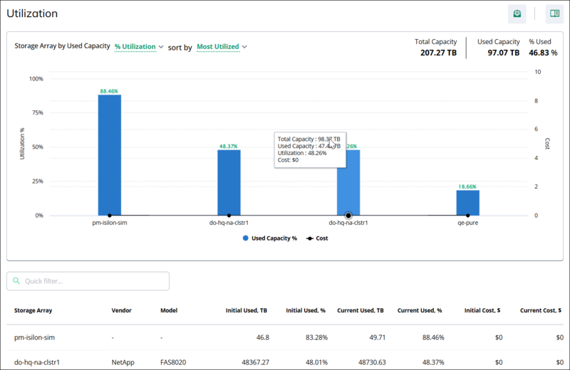
The Utilization window for storage shows the used capacity percentage of each storage array as a bar chart, the total capacity and used capacity summary values, and a table of per-array capacity values. The following table describes the controls and summary values in the storage view of the Utilization window:
Storage view control or value | Description |
|---|---|
Storage Array by Used Capacity | A label followed by a metric selector. The selector sets what the chart plots for each storage array. |
sort by | Sets the order of the storage arrays in the chart. |
Total Capacity | The combined capacity of all listed storage arrays, in terabytes; for example, 975.24 TB. |
Used Capacity | The combined capacity in use across all listed storage arrays, in terabytes; for example, 180.22 TB. |
% Used | The combined used capacity as a percentage of the combined total capacity, for example, 18.48%. |
Used Capacity % chart | One bar for each storage array, labeled with the used capacity percentage of that array. Hover over the chart to view the total capacity, used capacity, utilization percentage, and cost for that point. |
Quick filter | Filters the table to the storage arrays that match the text you enter. |
The following table describes each column in the storage array table of the Utilization window:
Storage array table column | Description |
|---|---|
Storage Array | The name of the storage array. |
Vendor | The vendor of the storage array, for example, NetApp. A dash indicates that Virtana has no vendor information for the array. |
Model | The model of the storage array, for example, FAS8020. A dash indicates that Virtana has no model information for the array. |
Initial Used, TB | The used capacity of the array in the earlier comparison interval, in terabytes. |
Initial Used, % | The used capacity of the array in the earlier comparison interval, as a percentage of the total capacity of the array. |
Current Used, TB | The used capacity of the array in the selected reporting period, in terabytes. |
Current Used, % | The used capacity of the array in the selected reporting period, as a percentage of the total capacity of the array. |
Initial Cost, $ | The cost of the storage array in the earlier comparison interval. |
Current Cost, $ | The cost of the storage array in the selected reporting period. |
Utilization window for compute
The compute view of the Utilization window lists every host behind the Cost and Capacity Utilization chart, with the CPU utilization, memory utilization, and cost of each host.
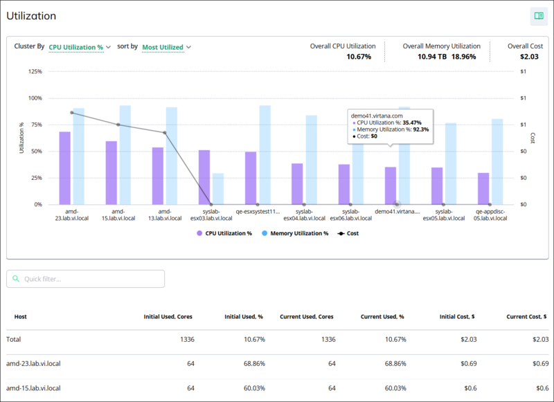
The Utilization window for compute shows CPU utilization, memory utilization, and cost for each host as a combined bar and line chart, the overall utilization and cost summary values, and a table of per-host core and cost values.
The following table describes the controls and summary values in the compute view of the Utilization window:
Compute view control or value | Description |
|---|---|
Cluster By | Sets the metric that the chart plots and orders the hosts by. |
sort by | Sets the order of the hosts in the chart. |
Overall CPU Utilization | The average CPU utilization across all listed hosts, as a percentage, for example 10.67%. |
Overall Memory Utilization | The memory in use across all listed hosts, followed by that amount as a percentage of total memory; for example, 10.94 TB and 18.96%. |
Overall Cost | The combined cost of all listed hosts for the selected reporting period. |
Utilization and cost chart | A CPU Utilization % bar and a Memory Utilization % bar for each host, plotted against the utilization axis on the left, and a Cost line plotted against the cost axis on the right. Point to a host to see its CPU utilization, memory utilization, and cost. |
Quick filter | Filters the table to the hosts that match the text you enter. |
The following table describes each column in the host table of the Utilization window:
Host table column | Description |
|---|---|
Host | The name of the host. |
Initial Used, Cores | The number of cores reported for the host in the earlier comparison interval. |
Initial Used, % | The CPU utilization of the host in the earlier comparison interval, as a percentage of the total cores of the host. |
Current Used, Cores | The number of cores reported for the host in the selected reporting period. |
Current Used, % | The CPU utilization of the host in the selected reporting period, as a percentage of the total cores of the host. |
Initial Cost, $ | The cost of the host in the earlier comparison interval. |
Current Cost, $ | The cost of the host in the selected reporting period. |
The Total row at the top of the host table sums the cores and the cost across all listed hosts and reports the combined CPU utilization percentage. The values in the Total row match the summary values in the window header.