Report Page
Each report has a dedicated page that shows you its output. A report can include up to 15 rows.
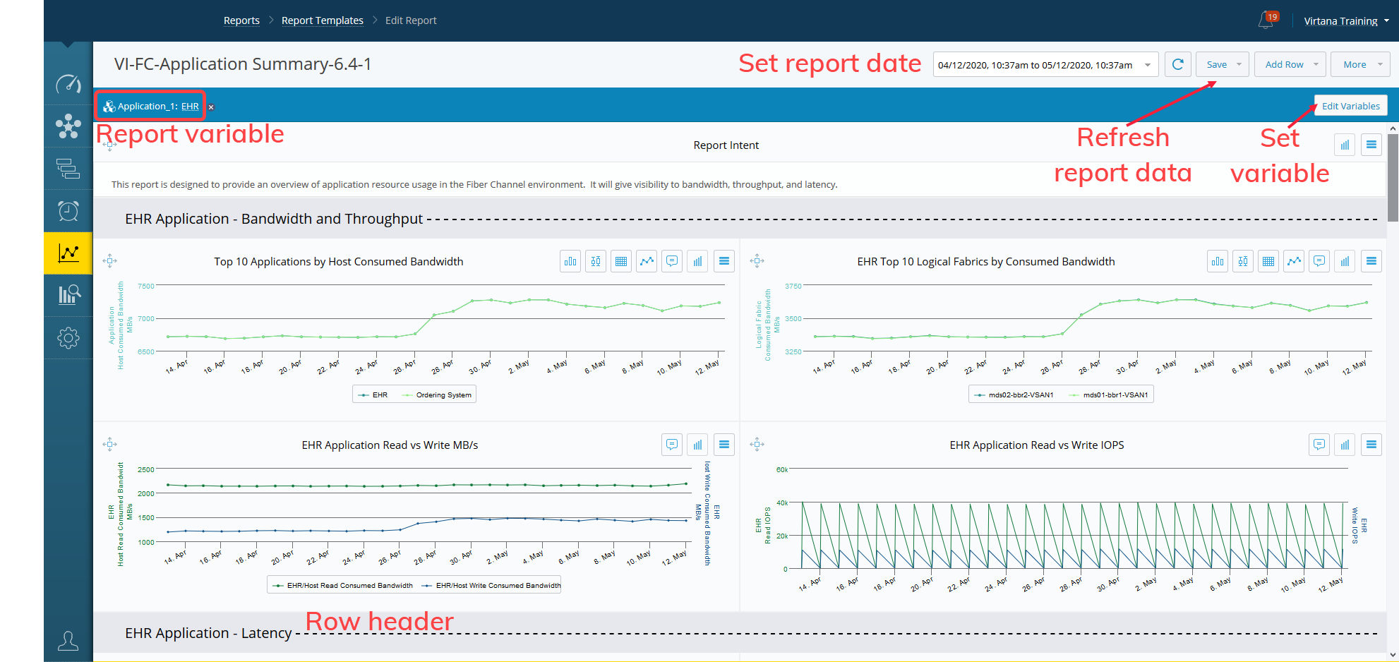
The report header includes a date field to set the date and time range for the report. You can select from a default range from 5 minutes up to 30 days or set a custom range. Use the circular arrow to refresh a report’s data any time you wish to view new data.
The report variable field lets you select a specific entity to filter the charts on the report. A chart may include a filter that is based on a report variable. This makes it easier to filter multiple charts by the same entity and change that entity easily.
The row headers are used to provide more information about the charts shown below them.
Set Report Date
The Custom Date Range option allows you to define the exact time period for which you want to view data in the chart. This provides flexibility beyond the predefined time ranges.
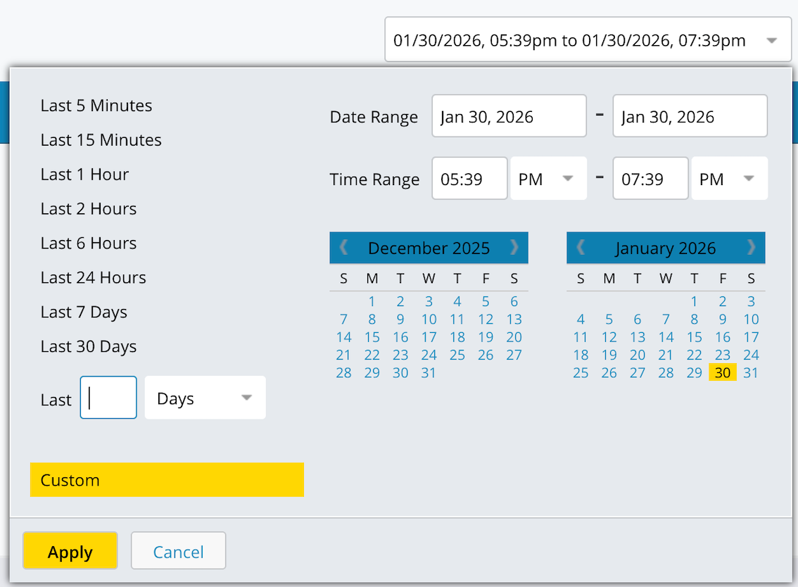
You can select a custom range using the calendar and time picker, similar to the existing quick-select options such as Last X Minutes, Last X Hours, and Last X Days.
When a custom range is applied, the chart updates to reflect only the data collected within the specified period.
Date and Time Range Selection
The Date and Time Range selector lets you control the time period for which data is displayed in charts and reports. You can quickly choose a predefined range or define a custom date and time range for more precise analysis.
To apply a selected range, click Apply.
Use quick selections to view commonly used time windows without manual date entry.
Options | Description |
|---|---|
Last 5 Minutes | Displays data collected in the last 5 minutes. |
Last 15 Minutes | Displays data collected in the last 15 minutes. |
Last 1 Hour | Displays data from the last hour. |
Last 2 Hours | Displays data from the last 2 hours. |
Last 6 Hours | Displays data from the last 6 hours. |
Last 24 Hours | Displays data from the last 24 hours. |
Last 7 Days | Displays data from the last 7 days. |
Last 30 Days | Displays data from the last 30 days. |
Relative Time Range
Displays data from the last specified number of days. Enter a value and select the unit (for example, Days).
Use the Custom option to specify an exact start and end date and time.
Date Range: Select the start date and end date using the calendar picker.
Time Range: Specify the start time and end time for the selected dates.
Click Apply.
Use a secondary time range in reports
The secondary time range lets you compare data from two different time periods side by side in the same report. Each panel in the report uses its own time range selector, so you can view historical trends alongside current data without creating separate reports.
The secondary time range behaves differently depending on the report type:
For dashboard and scheduled reports, the secondary time range is automatically set to the period that immediately precedes the primary time range. For example, if the primary range is the current week, the secondary range automatically shows the previous week.
For exported and snapshot reports, the secondary time range uses the value you selected in the UI.
To set a secondary time range:

Create a new report.
In the report toolbar, locate the two time range selectors at the top of the page. The left selector controls the primary time range. The right selector controls the secondary time range.
Click the secondary time range selector on the right.
Select the time range you want to compare against the primary range.
Click Save.
The report displays two panels. Each panel shows the same widgets using data from its respective time range.
Note
The two time range selectors are independent. Changing the primary time range does not automatically update the secondary time range, except in dashboard and scheduled reports where the secondary range always reflects the period before the primary range.
Unit Rendering for Uptime-Based Metrics
Overview
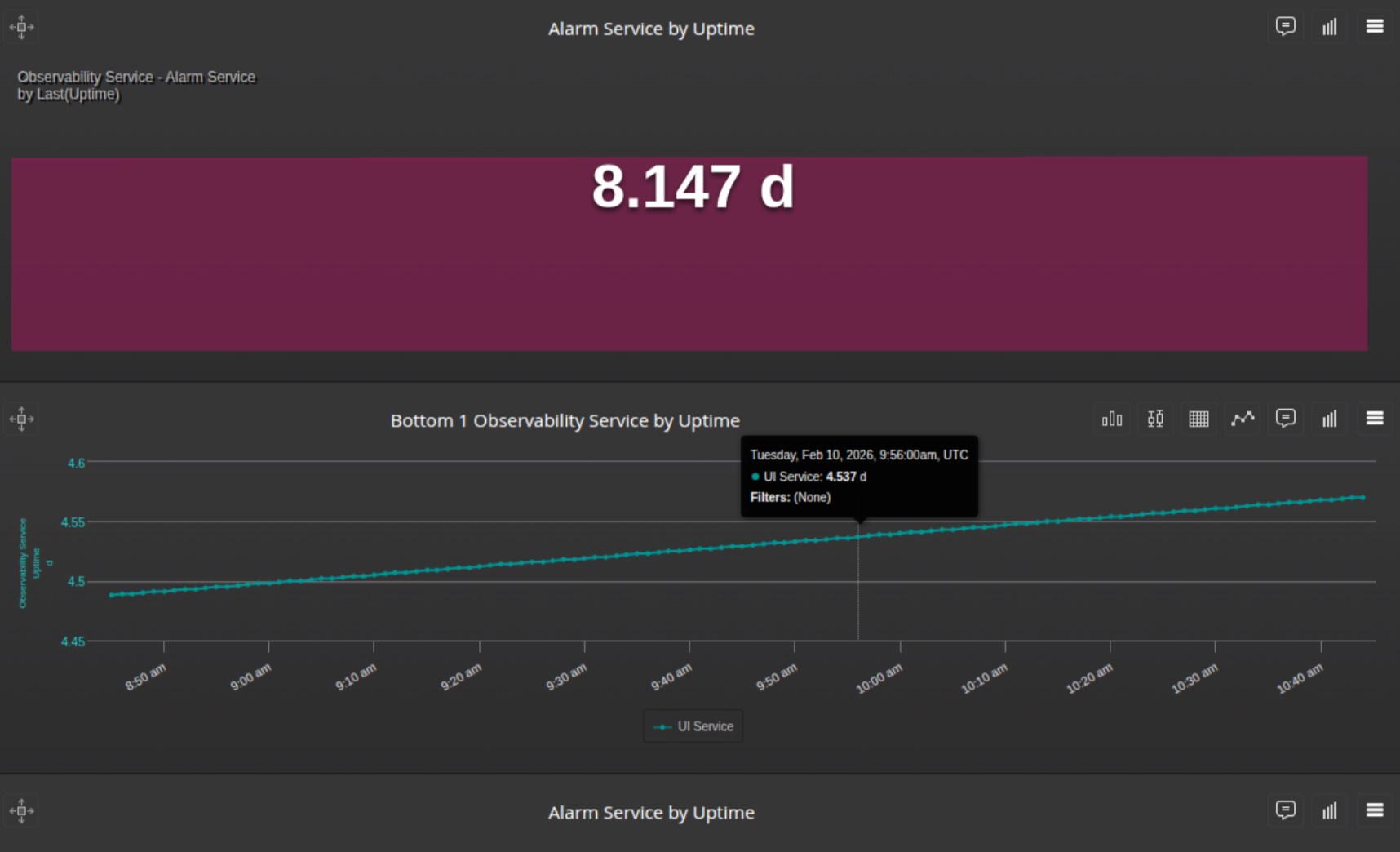
Uptime-based metrics are automatically displayed using the most appropriate time unit to improve readability and interpretation.
Previously, uptime-based metrics were always displayed in their render units (such as microseconds or milliseconds). For long-running durations, this resulted in very large numeric values that were difficult to read and interpret.
How Dynamic Time-Unit Rendering Works
For an uptime metric, the system dynamically converts and displays it in a higher-level time unit.
The conversion is based on the maximum value in the chart.
If the maximum value exceeds 1 unit of the next higher time unit, all values in the chart are displayed using that higher unit.
Unit conversion progresses in the following order and is capped at days:
microseconds → milliseconds → seconds → minutes → hours → days
Once converted, all values in the chart use the same unit for consistency.
Dynamic time-unit rendering is supported in:
Top N trends.
Line Charts.
Single-stat charts.
Inventory table charts.