Sidebar Menu
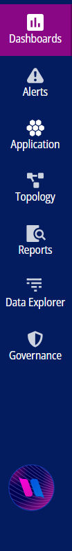
The Sidebar Menu displays a list of menus that are present in the Container Observability application. The following is the list of the available Sidebar Menu:
Business Dashboards: Enables customers to monitor custom metrics tailored to their specific business needs.
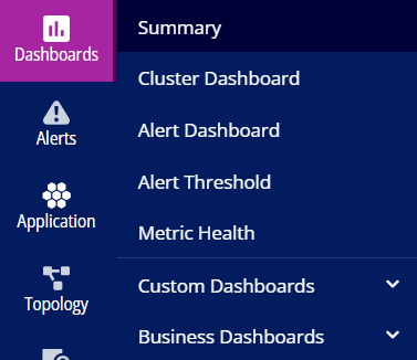
Summary: Facilitates customers to view the metrics health of threshold, create a summary, and analyze resource usages and alerts.
Cluster Dashboard: Facilitates customers to view graphical information related to cluster node counts, resource object counts, and latency requests.
Alert Dashboard: Provides a quick link which displays the list of alerts triggered in the application to analyze the root cause and resolve them.
Alert Threshold: Allows you to monitor the behavior of the set threshold value for each metric closely through various widgets in the dashboard. Each widget is created in the dashboard for each metric when the threshold value is set as per the user's requirement.
Metric Health: When you set a threshold value for each metric, widgets are created in a dashboard that represents the metric health flow of actual value to monitor.
Custom Dashboards: Allows you to create a new dashboard.
Business Dashboards: Facilitates customers to view the Victoria Metrics Dashboard and the Ingestor Dashboard.
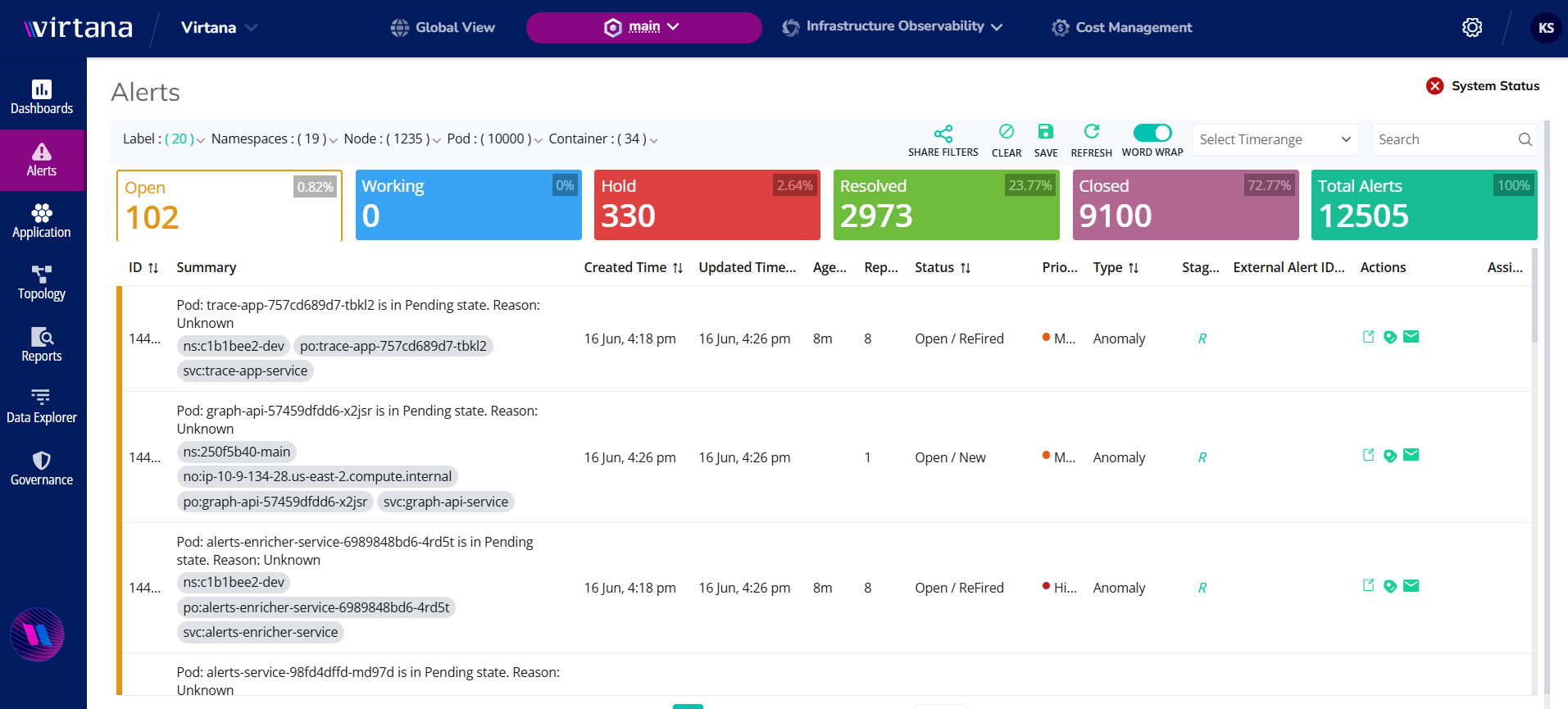
Alerts: Provides a quick link which displays the list of alerts triggered in the application to analyze the root cause and resolve them. This tab provides a detailed information on the following types of alerts:
Open: The white color tab indicates the number of open issues.
Working: The blue color tab indicates the number of pods/nodes/containers.
Hold: The red tab indicates the number of issues currently on hold. These anomalies are not observed at the moment but are retained to prevent duplicate alerts.
Resolved: The green color tab indicates the number of resolved issues.
Closed: The purple color tab indicates the number of closed issues.
Total Alerts: The green color tab indicates the total number of Alerts.
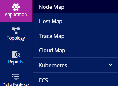
Application: Helps in monitoring the state of the cluster and individual pods, nodes, and containers. The following is the list of options under this tab:
Node Map: The Node Map enables you to view the condition of their running nodes along with several services like pods and containers of a particular node. It also represents the anomalies detected by Container Observability for a particular node to debug the issues.
Host Map: The Host Map provides visibility into processes running on standalone VMs that are external to the cluster but connected to workloads within the Kubernetes environment.
Trace Map: The Trace Map presents distributed tracing data in multiple formats, helping you visualize how requests traverse across services and operations, while identifying performance bottlenecks, failures, or latency issues.
Cloud Map: Cloud Map allows you to monitor and analyze the state of your cloud services that are associated with the Kubernetes cluster, providing insights into their health, performance and connectivity within the cloud environment.
Kubernetes: Is an open-source container orchestration platform that manages the deployment, scaling, and operation of containerized applications. A Kubernetes cluster consists of a control plane and a set of worker nodes. Within the application, the Kubernetes map provides a detailed, real-time view of the cluster’s components. It enables users to see which components are currently enabled or disabled, based on the configuration of the target cluster. The map displays information across several categories, allowing users to monitor the status and details of each component within the Kubernetes cluster, such as nodes, pods, and deployed services
ECS: ECS (Elastic Container Service) is a fully managed container orchestration service provided by Amazon Web Services (AWS) that enables users to easily deploy, manage, and scale containerized applications. ECS supports Docker containers and allows you to run applications across clusters of EC2 instances or with AWS Fargate, removing the need to manage underlying infrastructure
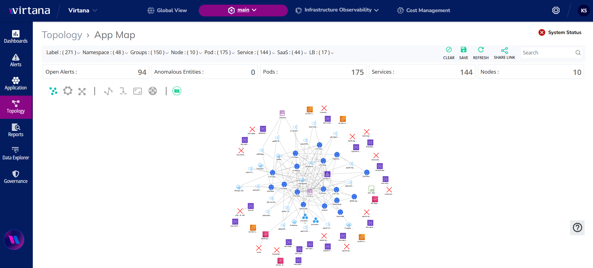
Topology: Displays real-time connectivity between workloads within the cluster, offering insights into overall application behavior, including inbound and outbound traffic between microservices and communication with external cloud services.
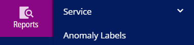
Reports: Allows you to view the overall performance, comparison of services, and the network flow between them. The following is the list of options under this tab:
Service: Allows you to view the overall performance, comparison of services, and the network flow between them at the L4 and L7 Level.
Anomaly Labels: Display a list of user-provided inputs that help incorporate user feedback into anomaly detection. Users can submit their inputs through alerts or the metrics dashboard.
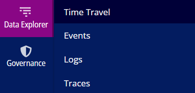
Data Explorer: Provides a detailed information on the following options:
Time Travel: Allows you to compare the current cluster state with the previous cluster states.
Events: Helps you to monitor the events listed when there is any state change of entity from the Kubernetes cluster.
Logs: The Log Dashboard offers a centralized view of log data generated by various workloads, including pods and nodes within the Kubernetes cluster. It helps monitor application health, troubleshoot issues, and support audit and compliance efforts.
Traces: Enables visualization and analysis of distributed traces collected from applications, helping users understand request flows across microservices and identify performance bottlenecks. It leverages the Jaeger UI to offer a familiar experience, including standard features like filtering and search.
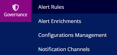
Governance: Provides a detailed information on the following options:
Alert Rules
Alert Enrichments
Configurations Management
Notification Channels