About Smart View
Use Smart View to view graphs and charts of an entity’s metrics and events during the time range you select, whether minutes or months past. Unlike dashboards, which you create, Virtana Service Observability provides Smart View pages for every entity in your environment.
On Smart View pages, you can view information about all the entities on which the anchor entity depends, either in a ranked list of cards or in an interactive dependency graph. SmartView leverages AI to prioritize the most important graphs and any anomalous metric data so it’s front and center for you to investigate. This unique combination of relevant information makes Smart View pages an apt tool for investigating infrastructure and service issues.
Opening Smart View
You can examine an entity’s Smart View page from several locations:
On a dashboard, click an entity name in the legend of a metric tile.
On a device page in Collection Zone, click Open in Smart View.
In Events or Inventory, click an entity name in the table.
On the Smart View page, enter an entity name in the search field.
Note
Clicking Smart View in the header takes you to the landing page where you can search for an entity to examine or select a recently viewed entity (if any) in the list.
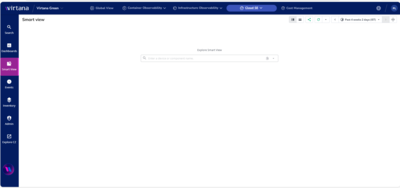
Tour of the Smart View page
When you open Smart View, you’ll notice that the Smart View page is sectioned into two panes: one for the anchor entity and the other for related entities. Use the slider between the panes to adjust the size of each.
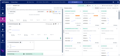
The header across the top applies to both panes. The header includes the split view (vertical or horizontal) buttons and the time range controls. The default split view is vertical split (side-by-side).
The anchor entity pane contains the primary entity that you are investigating in Smart View. In the default view, the anchor entity pane is on the left.
The related entities pane contains views of entities on which the anchor entity either depends or is related to. In the default view, the related entities pane is on the right.
Changing the time range
When investigating, you first might want to set the time range. In Smart View pages, the default time range is the past 24 hours. You can change the time range using one of several methods:
by using the time range buttons,
by moving the time slider in the primary metric card, or
by clicking an anomaly visualization in the primary metric card.
Set the time range to determine which entities are shown in the related entities pane and which data points are used in metric graphs.
Header
Use the left side of the header to view the navigation path. Use the right side to control how information is presented.

Item | Feature | Description |
|---|---|---|
1 | Navigation path | The breadcrumb or navigation path sets your view. It shows you which entity is currently in focus as the anchor entity on the Smart View page. You can change the anchor entity. For example, if you wanted to explore a related event, you can select to move it to the main pane. The navigation path shows the selected event as the anchor event and the Smart View page displays information for this new anchor event. |
2 | Explore more menu | Click the EXPLORE MORE button to jump directly to the specific tools you need, such as Container Observability or Inventory. The menu includes links tailored to your search results. |
3 | Split view | Select the display view for the anchor entity and the related entities panes. The default view is side-by-side (vertical split) and the alternate view is over-under (horizontal split). |
4 | Share and Refresh buttons | Click the Share button to open a dialog box where you can select options for the time range for the page and copy the link of the page to share with other users. Click the Refresh button to refresh the page immediately. Optionally, open the dropdown menu to set the refresh interval and default behavior, automatic or manual. |
5 | Time range | The time range controls provide a variety of ways to change the time range whenever you wish. When you change the time range, Virtana Service Observability updates all the model and metric information on the page. |
Tour of the Anchor entity pane
On the anchor entity pane, you can view details about the selected anchor entity, examine the severity of its events, and investigate primary and secondary metrics. The anchor entity pane includes the following sections:
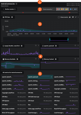
Item | Feature | Description |
|---|---|---|
1 | Information header | The anchor entity information, including name, links to data sources and Inventory, and the specified time range. Hold the pointer over the name of the anchor entity to view details about its properties and metadata. If needed, you can pin this tooltip so it remains open. This is useful for comparing data and copying values. |
2 | Events card | The collapsed view of the events card which includes the event status indicators and the event timeline. Click the arrow on the right of the name to expand the card and view the events in a column chart. |
3 | Primary metric card | The primary metric card features a graph of the metric and a time slider. If an entity reports multiple metrics with the same name, they are consolidated into a single multi-line graph with a Group by menu. Like the time range controls in the header, the time slider in this card controls the time range of all Smart View graphs.. |
4 | Secondary metric cards | Secondary metric cards feature graphs with y-axis labels and units that correspond to the time slider. Multi-instance metrics are plotted as combined graphs with distinct colored lines. You can promote a secondary metric to the primary metric card and vote on its relevance. |
5 | All metric cards | A group of cards of sparkline graphs illustrating the metrics that are associated with the anchor entity. |
Let’s take a closer look at some of these key features.
Information header
The header for the anchor entity is packed with information and helpful links to other features in Virtana, including Inventory and Collection Zone, so you can quickly investigate issues.
Entity details: Hold the pointer over the name of the anchor entity to view details about its properties, metadata, and any custom properties. Click the links to navigate to Inventory with the specific query in focus. For example, click the specified location to go to Inventory and view the associated entities for that location.
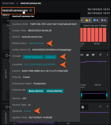
Data sources: Click the name of the anchor entity or the information icon to view the unique ID of the entity. From here, you can go to Inventory or Collection Zone to view details about the entity or device, including production state, priority, and event summary. For example, you can navigate directly to the device overview page in Collection Zone or view it as a query in Inventory.
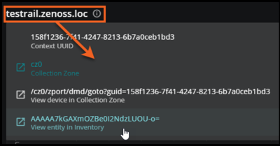
Time range: The time range shows you the scope of the metric and model data in the anchor entity panel. If you want to change this range, adjust the time range controls in the Smart View header.
Events card
An events card summarizes the events associated with an anchor entity during the current time range. Use the events card in your investigations of problems, for example:
Are specific event classes or event names correlated with performance metric changes?
Is Collection Zone configured to take action when problem conditions are present?
Does monitoring need to be adjusted?
Note
When you open the events card in the Related entities pane, you are viewing related events, not anchor events.
When the events card is collapsed, you can view the events timeline and the events severity status icons. The events timeline represents each event that occurred during the current time range with a column. The event severity status icons show the total number of each event severity in the current time range. The status icons are interactive: select a severity to include or exclude events. The severity status icons determine how the events appear on the anchor entity pane and all related entity cards.

When the events card is expanded, you can view the events in a density column chart. The column chart shows events grouped by the category you select. Options include Event severity, Event name, and Event group. The default setting is Event severity.
In the column chart, the current time range is divided into 24 equal periods, but the event rate varies. For example, a full 24-hour period shows an event rate per hour, while a full week shows an event rate per 6 hours.
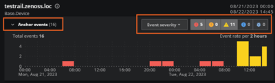
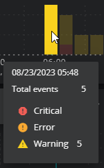
The chart represents the total number of events during each period with separate columns (or no column) color-coded to correspond to event severity, event name, or event class. The events appear in the columns as defined by their First Seen and Last Seen criteria. Therefore, each event might appear in more than one column in the chart. Hover your mouse over each column to view the details in a popup.
Primary metric card
On Smart View pages, the primary metric card is the first metric card on the anchor card during the current time range.
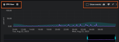
An AI assistant selects a metric for the primary metric card using the following factors:
The number of upvotes a metric has received from others in your organization, from you, and from other users in other organizations.
You can use the voting icons (thumbs up/thumbs down) to influence the sort order of a metric. Click the thumbs-up icon to increase the metric’s importance or the thumbs-down icon to decrease the importance.The metric with the highest score is placed in the primary metric card, and the remaining metrics are arranged in descending order below the primary metric card.
For metrics, whether the data was anomalous during the current time range.
The metric with the highest score is placed in the primary metric card, and the remaining metrics are arranged in descending order below the primary metric card.
When you select the Show events check box, Smart View displays events on all metric cards in the anchor entity pane.
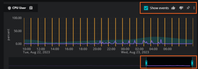
You can also change the time range at the bottom of the primary metric card. Move the start time and end time sliders to adjust to your specific time range. The graph in all the metrics update to reflect your new time range.
Edit the metric dictionary entry
In the primary metric card, you can edit the dictionary entry of a metric.
In the top-right of the card, click the vertical ellipsis (⋮).
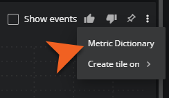
On the menu that opens, click Metric Dictionary. The Metric dictionary info dialog box opens.
Use the metric dictionary editor to edit the entry (including configuring Default grouping fields) and save your changes.
Metric card features
You can perform the following tasks on both the primary and secondary metric cards:
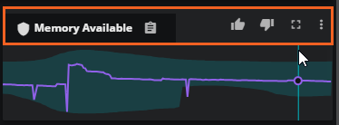
View metric details
Hold the pointer over the name of the metric to view details about its properties and metadata. This is useful when you have new sources sending data into Virtana, such as OpenTelemetry sources, and you want to better understand the types of metadata that you are receiving.
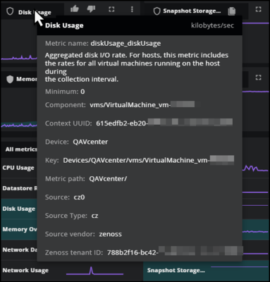
View anomaly shields
On metric cards, anomaly shield icons appear on the left side of metric names and indicate a metric's anomaly status. Use the table below to identify anomaly shields for your metrics.
Shield | Description |
|---|---|
| A metric tracked for anomaly detection. |
| A metric where there isn't enough historical data to train a model, or no anomalies have been detected during the current time range. |
| A metric where anomalies have been detected during the current time range. |


Typically, the primary metric tile contains a metric that is tracked for anomaly detection because an AI assistant prioritizes the most important metrics.
Copy the metric ID
In the top-left of the card, click the clipboard icon to copy the metric ID to your machine’s clipboard.
Vote on the metric’s importance
Use the voting icons (thumbs up/thumbs down) to influence the sort order of this metric card.
Click the thumbs-up icon to increase the metric’s importance
Click the thumbs-down icon to decrease the importance.
The metric with the highest score is placed in the primary metric card, and the remaining metrics are arranged in descending order below the primary metric card.
Promote a secondary metric card
In the top-right of the card, click the box icon to promote the secondary metric card to the primary metric card.
Create tile on a dashboard
In the top-right of the card, click the vertical ellipsis (⋮) and select Create tile on. Select if you want to create the metric card as a tile on a New Dashboard or My Dashboard.
Tour of the Related entities pane
The related entities pane displays one of three views of the entities or events on which an anchor entity depends.

Tile view contains one card for each entity on which an anchor entity depends. Tile view is the default view.
Dependency view contains an interactive, hierarchical graph of dependent entities.
Event view contains the collapsed or expanded event card at the top of the pane and a table of the related events.
Component view contains the collapsed view of component groups for the anchor entity. Open a component group to view a table of included components.
If an anchor entity doesn’t have any dependent entities during the current time range, the related entities area is empty. Note that card views might include a parent entity, but dependency views do not.
Tile view
A tile view displays a grid of individual cards containing information about each entity on which an anchor entity depends. The cards are arranged by relevance to the anchor entity, from top to bottom and left to right.
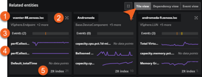
Item | Feature | Description |
|---|---|---|
1 | Entity name and types | Name of the entity and the associated types. Hold the pointer over the name of the related entity to view details about the selected entity's properties and metadata. |
2 | Move to main panel icon and voting buttons | Use this action button to make an entity in the related entities area the anchor entity, which moves it to the anchor card. When you move your pointer over the area to the left of the action button, the upvote and downvote icons appear. Use these buttons to promote or demote an entity's relevance to the anchor entity. |
3 | Events timeline | The events timeline. Click this timeline to examine its details in the anchor entity pane. |
4 | Metric sparklines | Most relevant metrics in sparkline graphs. The metrics within each card use the same time range as all other metrics on a Smart View page. |
5 | ZR Index | The ZR Index number is an AI-calculated score at the bottom of the card. Virtana Service Observability uses the numbers to arrange the cards from most relevant to least relevant during the current time range. When the time range changes, the arrangement of the cards is recalculated and updated as needed. For more information, see ZR Index numbers. |
Dependency view
When you select the Dependency view, you can view an interactive, hierarchical graph of the entities on which an anchor entity depends. The initial display shows the anchor entity and its immediate dependencies. When you move your pointer over an entity’s box, you can view information about the entity.
Each entity box contains its name and an icon. If any open event associated with the entity during the current time range has a severity level of Critical, Error, or Warning, then an event status icon also appears.
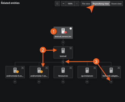
Let’s take a closer look at the entity box and its dependencies.
Item | Feature | Description |
|---|---|---|
1 | Anchor entity box | When you select the Dependency view, the anchor entity is in focus. The upper-right corner of the box features a white circle icon, which indicates that this entity is currently the anchor entity. You can view details in the anchor entity pane for any entity in the hierarchical graph. To do so, click the entity box in the graph. The anchor entity pane refreshes with details of the selected entity and the selected entity box now features the white circle icon. |
2 | Dependent entity box | Dependent entities cascade from the anchor entity. In the upper-right corner of the dependent entity box is the Move to main panel action button. When you click this box, Virtana Service Observability promotes the dependent entity to the anchor entity and updates both the anchor card and the dependency view. |
3 | Query trigger (arrow) below entity box | To discover additional dependencies, click the query trigger (down arrow symbol) below a dependency. Virtana Service Observability queries its database and displays the dependencies it finds. The arrow is replaced with the number of discovered dependencies. If no dependencies are found, the query trigger disappears. |
Event view
When you select Event view, you can view the anchor entity events in the collapsed or expanded event card at the top of the page and view details of the related events in a table below. Note that the pane title changes to “Related events”. You can click an event in the table to view it in the Events console for further discovery.
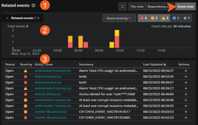
Item | Feature | Description |
|---|---|---|
1 | Pane name | When you select Event view, the pane name changes from Related entities to Related events. |
2 | Related events card | Summarizes the events related to the anchor entity during the current time range. You can open or close the related events card. See Events card for more information. |
3 | Related events table | The related events are listed in a table format so you can easily view status, severity, name, summary, and the last updated time. You can also use the action button to further explore the event in the Events console. |
The Event view assists you in your investigation. Use the Related events table to view the following types of information at a quick glance.
Column | Description |
|---|---|
Status | The current status of the event, such as Open or Closed. |
Severity | The severity level for the event. Levels include Critical, Error, Warning, Info, and Debug. The total number of each severity level is listed in the severity status icon bar above the table. |
Entity name | Name of the entity for this related event. Click the name to go to the Events console. |
Summary | A description of the event. |
Last Updated | Most recent time that the event occurred. |
Actions | To drill-down further on an event, click the arrow in the Actions column to go to the Events console. |
Component view
Click Component view to view an interactive list of device components and their respective components in tables. This perspective offers a valuable overview of a device and its components. You can view the device components in each group, inspect all the events for the group in this view, and navigate to Inventory for further details.
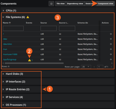
Item | Feature | Description |
|---|---|---|
1 | Groups of components | When you select Component view, the groups of components associated with the anchor entity appear. The number in parentheses indicates the number of components in each group. |
2 | Event severity indicators | The events icon appears next to the component group if any of its device components have events with a severity level of critical, error, or warning. |
3 | Device components table | The table lists each device component’s name, any events, source, schema ID, production state, location, and other details. Click the component’s name to view it in the Anchor panel. For further details about a device component, click the Actions button to view it in Inventory. |
Use the device component table to view the following types of information at a quick glance.
Column | Description |
|---|---|
Name | Name of the device component for this related device. Click the name to make it the anchor entity. |
Events | Total number of open events with the highest level of severity in the last 24 hours for the component. Levels include Critical, Error, and Warning. Click the icon to open the Events console for more details. |
Source | The collector or data source for the device component, such as ‘cz0’. |
Source type | The type of data source, such as Collection Zone. |
Schema ids | Unique identifier that defines the device component. |
Production State | The operational status of the device component in a monitored environment, for example, fully operational (“Production”) or currently in maintenance (“Maintenance”). For Collection Zone (CZ) data, Virtana uses production state to determine if it should collect data from the monitored entity. |
Location | Physical location of a device component. A device component can have one location, as general as city and state, or as specific as rack or closet. Locations are used in dashboard map tiles. |
Systems | Systems are intended to follow virtual setups, such as those in a network setup or systems grouped by functionality. |
Id | Unique identifier for the device component. |
Actions | To examine more details about a device component, click the arrow in the Actions column to go to Inventory. |
There are multiple ways to customize the table’s data to simplify viewing large numbers of components. For example, you can filter components in the columns as well as pinning, sorting, and autosizing columns.
To filter the components in the table, enter filter text in the column header. To remove the filter, clear the text.
Pin a column to the left or right sides of the table. This allows you to keep a specific column visible while scrolling through the table.
Sort the rows in ascending or descending alphabetical order, or clear any previously applied sort options.
Autosize the specified column or all the columns in the table, or choose to autosize all the column contents, but not the header.
ZR INDEX numbers
Each related entity tile includes an AI-calculated score, its ZR INDEX number, at the bottom of the tile. Virtana Service Observability uses the numbers to arrange the tiles from most relevant to least relevant during the current time range. When the time range changes, the arrangement of the tiles is recalculated and changed as needed.
When you hover your pointer over a ZR INDEX number, Virtana Service Observability displays a summary of the factors that played a role in calculating the number.
Example related entity tile
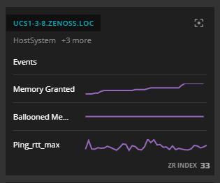
ZR INDEX Summary displayed

The following factors are used in calculating ZR INDEX numbers:
Are there any critical or error events during the current time range? If so, critical events are weighted three times more heavily than error events.
Were any anomalies detected during the current time range?
Has the entity been upvoted or downvoted?
How many nodes are between the entity and the anchor entity (in the of the anchor entity)? directed acyclic graph
The Virtana Service Observability AI judges each factor to calculate ZR INDEX numbers. In theory, a ZR INDEX number could be 100, but scores greater than 40 are rare. Multiple downvotes can result in negative ZR INDEX numbers.