Basic Chart Types
The Basic Chart category contains six chart types:
Single Stat Card
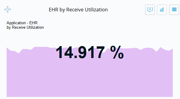
The Single Stat Card displays a single statistic that can be read from across the room.
Line Chart
The Line Chart compares different metrics and entity groups (hierarchies) over time to identify patterns that merit further investigation.
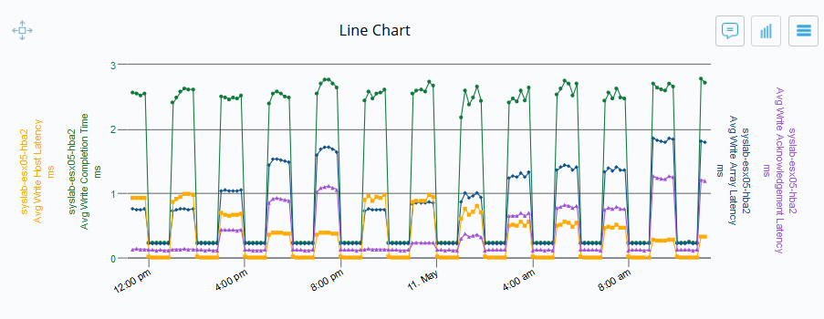
Line charts can also render metrics from logically equivalent entities. When you choose an entity type that is logically equivalent to another entity type (e.g., an ESX Host and a UCS Blade), you will be able to select a metric belonging to both. Metrics from the logically equivalent entity are shown with the entity type in parentheses.
Free Form Chart
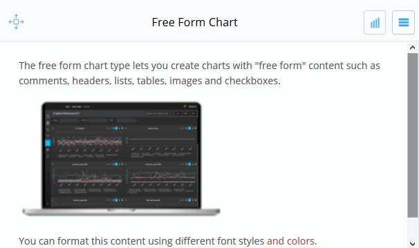
The Free Form Chart allows you to create a chart with free from content like comments, headers, images, bulleted or numbered lists, check boxes and format the content using different font styles and sizes.
Inventory Chart Types
The Inventory chart types display information based on entity properties.
Inventory Bar Chart
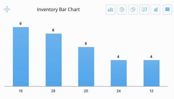
The Inventory Bar Chart displays entity system or custom properties in a bar chart. Property types are grouped into bars, with the property value and the corresponding number displayed at each end of the bar.
Inventory Donut Chart
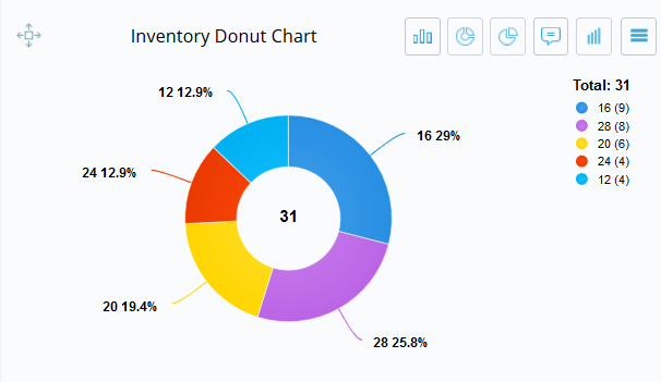
The Inventory Donut Chart displays entity system or customer properties in a donut chart. The value displayed in the “donut hole” is the total number of entities examined, while the values shown on the “donut ring” show the property value and the corresponding percentage of entities that have that value.
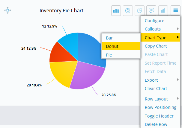
Inventory Pie Chart
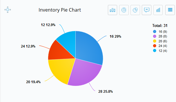
The Inventory Pie Chart is like the donut chart in that it shows the property value and the corresponding percentage of entities that have that value. However, the total number of entities is displayed to the right.
Inventory Table Chart
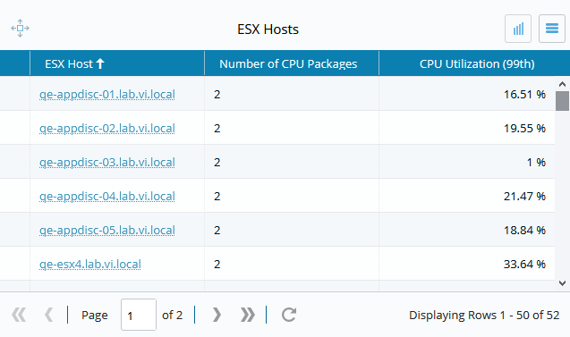
Use the Inventory Table Chart to view properties and metrics for a selected entity type in a table format.
Scheduled reports and snapshots of the Inventory Table Chart are not currently supported. Export using CSV.
Note
When data are exported to CSV, values listed as percentages (e.g., 50%) will be exported as decimal numbers (e.g. 0.5).
Threshold colors and icons are not included in data exports.
If you have configured the chart to display colors when approaching or crossing thresholds for multiple metrics, it is possible to have a yellow warning (approaching threshold) and a red warning (exceeding threshold) on different metrics for the same device. In such a case, the most serious warning color (red) will display.
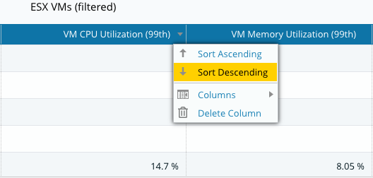
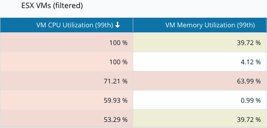
Inventory Table Charts can be sorted by metric columns. Hovering over the column heading will reveal a menu where you can select the sorting order.
Clicking on an entity name will take you directly to the entity's Overview tab in Inventory View.
Toggling Between Charts
You can toggle between the bar, donut, and pie charts by selecting an icon on the top right of the chart.
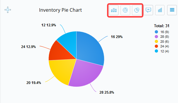
You can also use the chart menu to toggle between chart types.