 Metric + Number tile
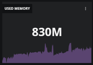
The Metric + Number tile displays an area chart of the data points of one metric, along with the metric’s most recent data point in the current time range. The data points to include in the chart can be limited to one entity or can be an aggregation of all entities in the dashboard’s scope. When an area chart is not necessary, you can configure the tile to display only the most recent data point.
The area chart in this tile uses the lowest data point from the current time range for the vertical axis minimum, rather than zero, to highlight the metric’s trend and shape.
Example tiles
Data point with chart
Data point only

Tile configuration options
- Tile title
The text that appears in the upper-left corner of a tile.
- Metric
The search field for finding entity or metric names in the dashboard's scope. A metric must be specified; an entity is optional.
If a search term matches both entities and metrics, both are shown, in separate lists.
When no entity is specified, the data points of all entities in the dashboard's scope that use the specified metric are aggregated.
- Metric aggregator
Aggregation function used to combine multiple matching metrics into a single series.
- Time aggregator
Aggregation function used to summarize the series into the single displayed number. Options:
last (default) - Displays the most recent data point in the current time range.
mean - Displays the arithmetic mean of all data points in the current time range.
maximum - Displays the highest data point in the current time range.
minimum - Displays the lowest data point in the current time range.
standard deviation - Displays the standard deviation of all data points in the current time range.
sum - Displays the sum of all data points in the current time range.
The default value (last) preserves the existing behavior of all previously configured tiles.
- Show metric chart
A toggle; show or hide the area chart.
- Compact value
A toggle; show the raw metric value or show a rounded value in simplified notation.
- Color
The color to use in the area chart.
- Tile scope filters
(Optional) Create a specific filter just for the tile. This is useful if you need to compare different services side-by-side. For example, you can compare the performance of your services in different regions.
Use the query builder to create and apply a filter to the tile:
Click the + (plus sign) to add a clause.
To define the clauses, click in the first field to select an entity field.
Select your operator, then select your value.
To add or remove clauses, use the buttons in the query.
- Advance
(Optional) Fields for optimizing data point alignment.
Advanced options
The Advanced area provides two fields for optimizing data point alignment options. The settings in these fields apply to all metric series used in the tile.
The alignment options provide a standardized way to display data points when the amount of space for display and the time range to represent are variable. The defaults for these options are industry best practices.
Alignment
The method to use to align data points in all series.
none | Do not align; use raw data points. |
interpolate | Insert data points between adjacent data points around the alignment period boundary. |
next older | Shift the oldest data point before the alignment period boundary to the boundary. |
mean | Replace all data points in the alignment period with the arithmetic mean of their values. When a collection gap occurs, line charts using mean show a straight line across the gap, with no selectable values between the known data points. |
maximum | Discard all data points in the alignment period except the maximum value. |
minimum | Discard all data points in the alignment period except the minimum value. |
standard deviation | Replace all data points in the alignment period with the square root of the mean variance of their values. |
sum | Replace all data points in the alignment period with the sum of their values. Works with numeric and distribution values. |
count | Replace all data points in the alignment period with the sum of their values. Works with numeric and Boolean values. |
Alignment period
The time interval to aggregate, used only with aggregation methods (mean, maximum, minimum, standard deviation, sum, and count).
For example, if the data to aggregate includes 60 data points in an interval of 30 minutes, selecting an alignment period of 5 minutes (5m) would yield 6 aggregated data points.