Alert Dashboard
The Alert Dashboard is a centralized tool that provides high-level insights into all alerts occurring across your infrastructure in a single, intuitive interface. This dashboard leverages data from multiple sources to offer a comprehensive summary of alerts, enabling you to monitor trends, identify patterns, and make informed decisions to optimize system performance and reliability.
By using this dashboard, you can quickly assess the health of your environment and focus on the most critical issues without being overwhelmed by repetitive data.
Filtering and customizing data
You can customize the information displayed on the dashboard using the following controls:
Source Type filter: Select the data source from the drop-down menu to view relevant information sourced from Infrastructure Observability (IO), Container Observability (CO), Service Observability (SO), or other platforms.
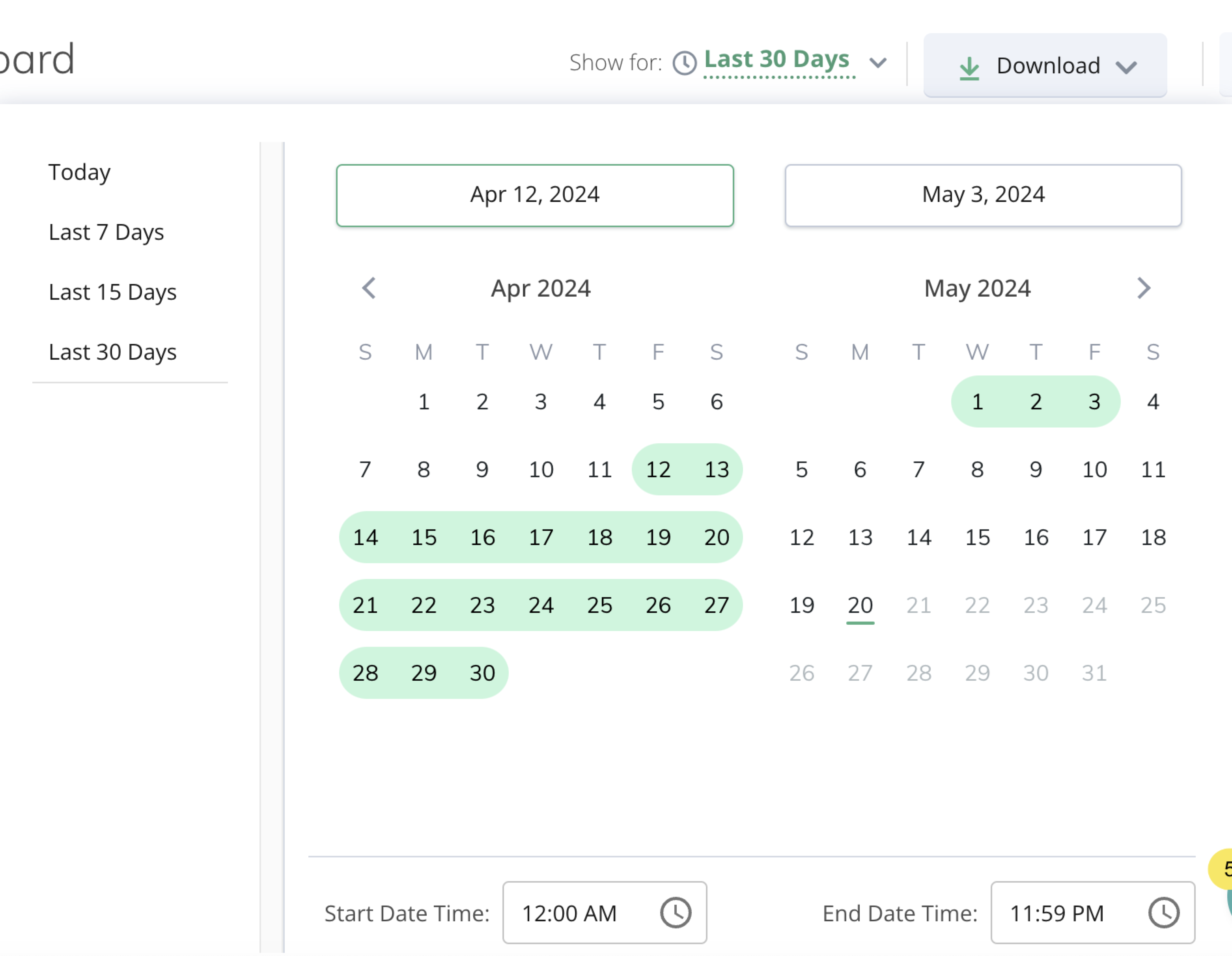
Show Alerts For: This feature allows users to specify the time period for viewing alerts. They can choose from predefined options such as the last 7, 15, or 30 days, or opt to view alerts from the current day. Also, you can choose custom dates and times.
Download: To save the alert data in PDF format, click Download.
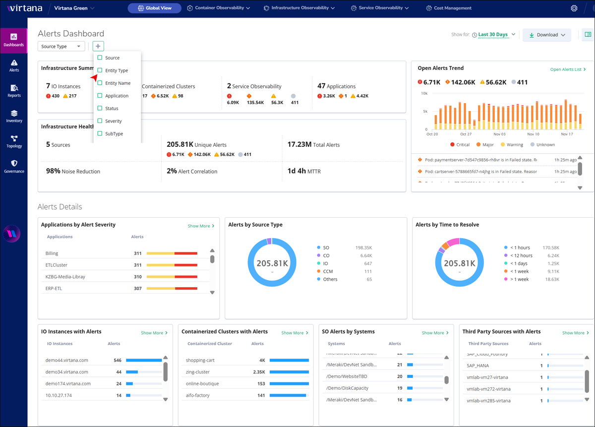
Infrastructure Summary panel
The Infrastructure Summary tab offers an overview of essential infrastructure components, including:
Components | Description |
|---|---|
IO Hosts | Displays data for critical and warning events on IO hosts. Click the IO host tab to view detailed information and graphs. |
Containerized Clusters | Provides an overview of all containerized clusters. Click the Containerized Clusters tab to explore detailed metrics and visualizations. |
Service Observability (SO) | This section provides you with a centralized and actionable overview of all Virtana SO alerts across your monitored systems, enabling you to quickly assess the health and stability of your critical services. |
Applications | Shows data for all applications. Click the Application tab to delve into specific details and analytics. |
Infrastructure Health Overview
Here, you can view the detailed information about the health and performance of your infrastructure.
Sources: The dashboard aggregates data from multiple sources to offer comprehensive insights into your infrastructure status.
Unique Alerts: With a significant number of unique alerts, you can stay informed about critical events and potential issues.
Noise Reduction: Efficient noise-reduction techniques ensure you can focus only on relevant information, enhancing productivity. A higher percentage means you can view fewer repetitive notifications, allowing you to focus on unique issues.
To find the Noise Reduction percentage, the system looks at the number of raw alerts that came in and compares them to the number of unique alerts left after de-duplication.
The system uses the following calculation logic to determine the percentage of noise reduced:
Noise Reduction (%) = ((X − Y) / X) × 100Variables
Description
X
The total number of raw alerts that entered the system before de-duplication.
Y
The number of unique alerts remaining after the system grouped duplicates.
Alert Correlation: A high alert correlation rate aids in identifying patterns and relationships between different alerts, facilitating proactive action. A higher percentage means more alerts are being grouped into related alerts, which reduces investigation effort and helps you focus on the alerts that really matter.
MTTR: Mean Time To Resolution (MTTR) indicates issue resolution efficiency, contributing to operational effectiveness. Usually, a lower MTTR indicates that you are identifying and fixing problems quickly.
Every time you close an alert, the system calculates the specific duration of that alert's life.
lifecycle_time = alert_closure_time − alert_creation_timeThis lifecycle_time value is stored with the alert when it is closed.
To show you the average for your dashboard, the system looks at all alerts that were closed within your selected time range (such as the last 24 hours or the last 7 days). In other words, MTTR is the sum of all individual resolution times divided by the total number of alerts closed during that period.
Open Alerts Trend
The Open Alerts Trend chart provides a graphical representation of the distribution of critical, major, and warning alerts over time.
The Open Alerts Trend chart provides you with valuable insights into the distribution of alerts across different severity levels and helps you identify periods of heightened alert activity. By analyzing this data, you can make informed decisions and take proactive measures to address critical issues as they arise.
Graphical View: The chart displays bars representing the number of critical, major, and warning alerts recorded over a specified time period. Users can quickly identify trends and fluctuations in alert volumes.
Hover Details: When you hover over a specific bar on the chart, detailed information about the alerts recorded during that time interval is displayed. This includes the number of critical, major, and warning alerts, as well as the specific date and time of the data point.
Click Open Alert List, and you are redirected to the Alerts page, where you can access detailed information about the alerts. Refer Alerts for more details.
Dashboard Alert Details
In the Alert Details View of the dashboard, users can access various insights and metrics related to alerts. Here are the key components available in this view:
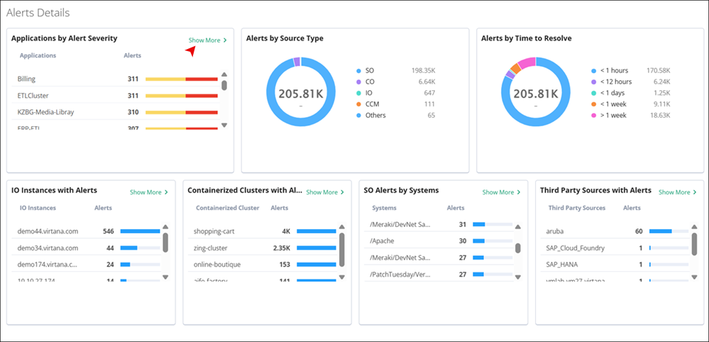
Applications by Alert Severity: This section provides a breakdown of alerts based on their severity levels within different applications. It allows you to quickly identify which applications are most affected by critical, major, warning, minor, info, or unknown alerts. You can click on the bar that displays the alert severity with numbers.
Alerts by Source Type: You can view alerts categorized by your source type. This section helps in understanding the distribution of alerts originating from different sources, such as CO, IO, or others.
Alerts by Time to Resolve: This section displays the distribution of alerts based on the time taken to resolve them. You can access the efficiency of their resolution processes and identify any trends or outliers in the time-to-resolve metrics.
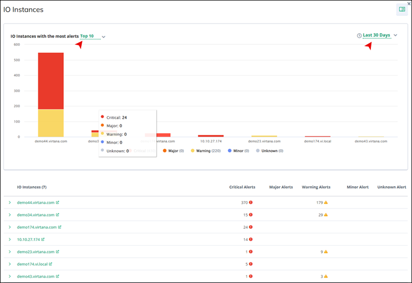
IO Instances with Alerts
Here, you can view a list of IO Instances that have generated alerts. It provides insights into which hosts are experiencing issues or generating alerts, allowing you to focus your attention on addressing these issues.
Click Show more to view details of IO Instances, including those with the most alerts. You can choose to display the top 5, 10, 20 hosts within a time frame of 7, 15, 30 days, or today's data. A graphical representation showcases major, warning, and critical alerts, visually distinguishing them with red, orange, and yellow, respectively.
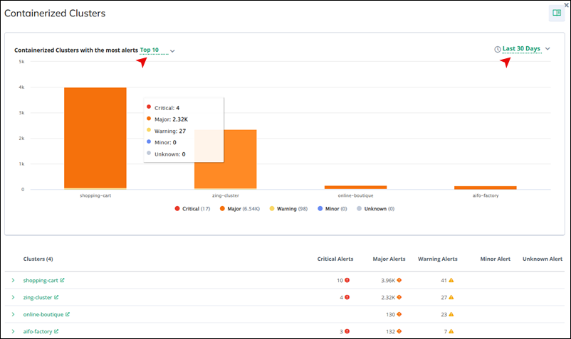
Containerized Clusters
This section lists containerized clusters that have generated alerts. You can monitor the health of containerized environments and take proactive measures to address any issues affecting these clusters.
Click Show more to access details of containerized clusters, including those with the most alerts. You can select to display the top 5, 10, 20 clusters within a time frame of 7, 15, 30 days, or today's data. The graphical representation highlights major, warning, and critical alerts, using red, orange, and yellow, respectively, for visual clarity.
Service Observability Alerts by Systems
In this section, you can view a system-level overview of all Virtana SO alerts across your monitored environment. In this tab, you can quickly identify which systems are generating the highest volume of Virtana SO alerts, as each system is listed alongside its corresponding alert count and a visual indicator of alert severity.
Click Show more to access details of Virtana SO systems, including those with the most alerts. You can select to display the top 5, 10, 20 clusters within a time frame of 7, 15, 30 days, or today's data. The graphical representation highlights major, warning, and critical alerts, using red, orange, and yellow, respectively, for visual clarity.

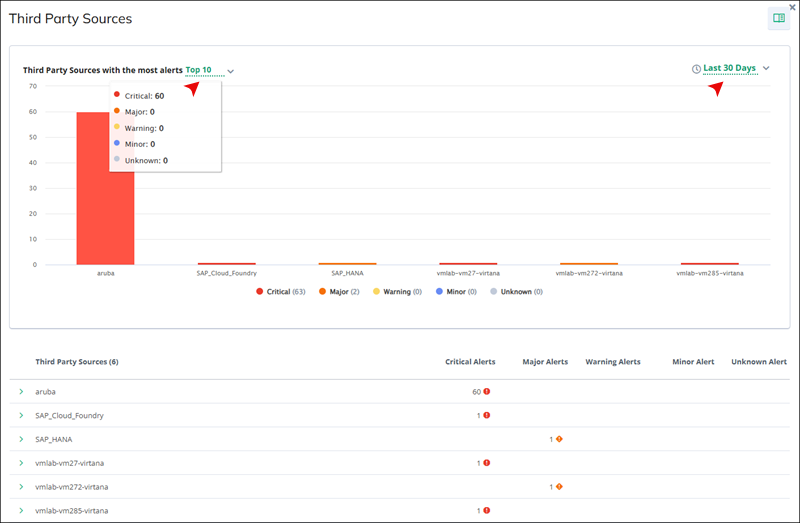
Third Party Sources with Alerts
You can see a list of third-party sources that have triggered alerts. This helps in identifying any issues originating from third-party monitoring solutions.
Click Show more to access details of third-party sources, including those with the most alerts. You can select to display the top 5, 10, 20 sources within a time frame of 7, 15, 30 days, or today's data. The graphical representation highlights major, warning, and critical alerts, using red, orange, and yellow, respectively, for visual clarity.