On-Premises storage array cost and capacity summary
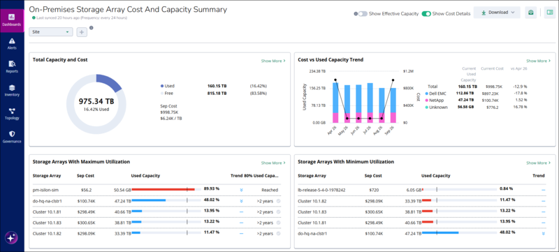
The On-Premises Storage Array Cost and Capacity Summary dashboard in Global View shows the capacity, utilization, and monthly cost of the on-premises storage arrays in your environment. The dashboard combines capacity data and cost data in one view, so you can see how much storage you have, how much of it is in use, and what that storage costs.
Use this dashboard to do the following:
Check the total, used, and free capacity of your on-premises storage arrays, and the cost of that storage for the current month.
Track how used capacity and cost change over time for each storage vendor.
Identify the storage arrays with the highest utilization, and see when each array is forecast to reach 80% of its capacity.
Identify the storage arrays with the lowest utilization, so you can reclaim or redistribute unused storage.
Filter all dashboard data by site, vendor, model, storage array name, and other attributes.
Open the storage array cost and capacity dashboard
To open the On-Premises Storage Array Cost and Capacity Summary dashboard from the Dashboards page in Global View, perform the steps:
In the Virtana Platform header, click Global View.
In the left navigation pane, click Dashboards.
Click On-Premises Storage Array Cost and Capacity Summary.
The dashboard opens and shows data for all sites.
 |
Dashboard header and controls
The dashboard header contains the controls that apply to all panels on the On-Premises Storage Array Cost and Capacity Summary dashboard. The following table describes each control.
Control | Description |
|---|---|
Sync status | Shows when the dashboard data was last synchronized and the synchronization frequency. For example, Last synced 20 hours ago (Frequency: every 24 hours). |
Add filter + | Opens a list of attributes you can add as filters, such as Vendor, Model, and Name. You can select up to 10 options in each filter. After you reach the limit, you can't select any more options. |
Show Effective Capacity | Turns effective capacity values on or off for all panels. Point to the information icon to view a description of effective capacity. By default, this toggle is off. |
Show Cost Details | Shows or hides cost information, such as monthly cost and cost per TB, on the dashboard panels. By default, this toggle is on. |
Download | Downloads the dashboard data. Click Download to download the data in PDF and XLSX format. |
Total Capacity and Cost panel
The Total Capacity and Cost panel shows the overall capacity and cost of the storage arrays that match the current filters. Use this panel to see at a glance how much storage capacity you have, how much of it is in use, and what it costs this month.
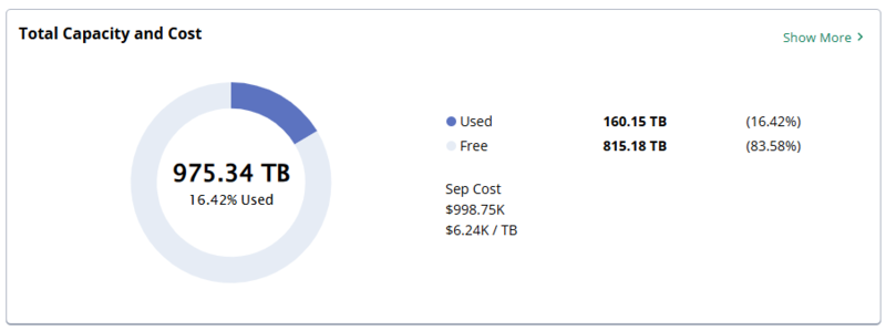
The Total Capacity and Cost panel contains the following elements:
Panel element | Description |
|---|---|
Donut chart | Shows the proportion of used capacity (dark blue) to free capacity (light gray). The center of the chart shows the total capacity and the percentage of capacity that is used, for example, 975.34 TB and 16.42% used. |
Used | The used capacity and its percentage of total capacity, for example, 160.15 TB (16.42%). |
Free | The free capacity and its percentage of total capacity, for example, 815.18 TB (83.58%). |
Month Cost | The storage cost for the current month, for example, Sep Cost $998.75K. |
Cost per TB | The current month's cost divided by the used capacity, for example, $6.24K / TB. |
Cost and Capacity Summary window for total capacity
Click Show More on the Total Capacity and Cost panel to open the Cost And Capacity Summary window. The window breaks down the total capacity, utilization, and cost of your on-premises storage arrays by site, so you can compare sites with each other. By default, the window groups data by Site, shows the current month, and sorts items by Most Utilized.
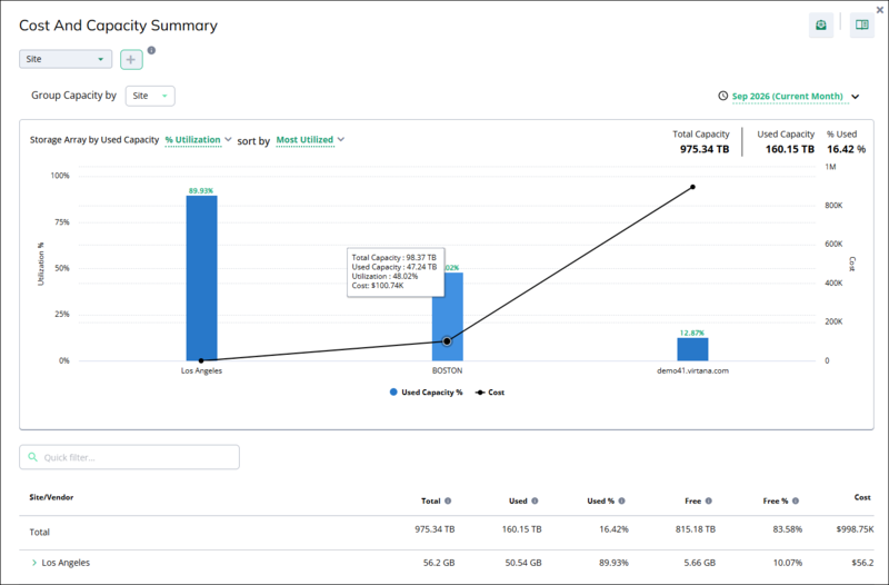 |
The Cost And Capacity Summary window contains the following controls and elements:
Options | Description |
|---|---|
Add filter + | Filter the window by site, vendor, and other attributes. These controls work the same way as on the dashboard. |
Group Capacity by | Groups the chart and table by an attribute. The default for this window is Site. You can select another attribute, such as Name, to view individual storage arrays. |
Time period | Selects the month to show. By default, the window shows the current month. |
Chart metric | Selects the capacity metric that the chart bars show, for example, % Utilization. |
sort by | Sorts the chart and table. Select Most Utilized to show the most utilized items first, or Least Utilized to show the least utilized items first. |
Total Capacity, Used Capacity, and % Used | Summary values for all items in the window, for example, 975.34 TB total, 160.15 TB used, and 16.42% used. |
Chart | Shows one bar for each site. The bar height and the label above the bar show the used capacity percentage (left axis). The black line shows the cost of each site (right axis). The legend identifies Used Capacity % and Cost. |
Chart tooltip | Appears when you point to a bar. Shows the Total Capacity, Used Capacity, Utilization, and Cost of the site. |
Quick filter | Filters the table rows by the text that you enter. |
When the window is grouped by site, the table shows a Total row and one row for each site. Click the expand arrow (>) on a site row to view the items in that site. Point to the information icon in a column heading to view a description of the column. The table contains the following columns:
Column | Description |
|---|---|
Site/Vendor | The name of the site, or of the vendor when you expand a site row. |
Total | The total capacity of the storage arrays in the site. |
Used | The used capacity of the storage arrays in the site. |
Used % | Used capacity as a percentage of total capacity. |
Free | The free capacity of the storage arrays in the site. |
Free % | Free capacity as a percentage of total capacity. |
Cost | The storage cost of the site for the selected month. |
To compare the capacity and cost of your sites, do the following:
On the Total Capacity and Cost panel, click Show More. The Cost and Capacity Summary window opens.
In the time period list, select the month that you want to analyze.
In the sort by list, select Most Utilized or Least Utilized.
Point to a bar in the chart to view the total capacity, used capacity, utilization, and cost of that site.
In the table, click the expand arrow (>) on a site row to view more details for that site.
Optional: To find a specific site in the table, enter its name in Quick filter.
Tip
Compare the bars with the cost line to find sites where cost is high, but utilization is low. For example, a site with 12.87% utilization and $897.95K cost has a large amount of paid-for capacity that isn't in use.
Cost vs used capacity trend panel
The Cost vs Used Capacity Trend panel shows how used capacity and cost changed over the last six months, broken down by storage vendor. Use this panel to see whether storage consumption and cost are growing or shrinking, and which vendors contribute the most.
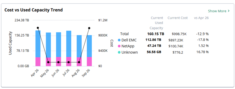 |
The Cost vs Used Capacity Trend panel contains the following elements:
Panel element | Description |
|---|---|
Stacked bars | Shows the used capacity for each month, with one color for each vendor, such as Dell EMC, NetApp, and Unknown. The left axis shows used capacity. |
Vendor summary | Lists the Total and each vendor, with the colored dot that identifies the vendor in the chart. |
Current Used Capacity | The used capacity for the current month, for each vendor and in total, for example, 160.15 TB in total. |
Current Cost | The storage cost for the current month, for each vendor and in total, for example, $998.75K in total. |
vs Month | The percentage change in used capacity between the first month of the time range and the current month. For example, vs Apr 26 compares April 2026 with the current month. A negative value, such as -12.9%, means that used capacity decreased. |
Cost vs used capacity trend window
Click Show More on the Cost vs Used Capacity Trend panel to open the Cost vs Used Capacity Trend window. The window shows the monthly used capacity and cost for each vendor over a selected time range, with a month-by-month table. By default, the window groups data by Vendor and shows the Last 6 Months.
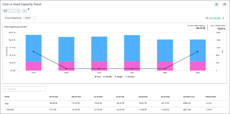 |
The Cost vs Used Capacity Trend window contains the following controls and elements:
Options | Description |
|---|---|
Group Capacity by | Groups the chart and table by an attribute. The default for this window is Vendor. |
Time range | Selects the time range for the chart and table. By default, the window shows the last six months. |
Current Used Capacity | The used capacity for the current month, for example, 160.15 TB. |
Month vs Month Delta | The percentage change in used capacity between the first month and the current month, for example, Apr vs Sep26 Delta -12.9 %. |
Chart | Shows stacked bars of used capacity for each month, with one color for each vendor (left axis), and a black line for the monthly cost (right axis). The legend identifies Cost and each vendor. |
Quick filter | Filters the table rows by the text that you enter. |
The table in the Cost vs Used Capacity Trend window shows a Total row and one row for each vendor. Click the expand arrow (>) on a vendor row to view the storage arrays of that vendor. The table contains the following columns:
Column | Description |
|---|---|
Vendor | The name of the vendor, or of the group that you selected in Group Capacity by. |
Month Used | One column for each month in the time range, for example, Apr 26 Used through Sep 26 Used. Each column shows the used capacity for that month. |
Month Month Cost | The storage cost for the current month, for example, Sep Month Cost. |
6-Month Delta | The percentage change in used capacity between the first month and the last month of the time range. For example, a change from 183.88 TB in April to 160.15 TB in September is a delta of -12.9%. |
To analyze how used capacity and cost change over time, do the following:
On the Cost vs Used Capacity Trend panel, click Show More. The Cost vs Used Capacity Trend window opens, grouped by vendor.
In the time range list, select the time range that you want to analyze.
Compare the stacked bars across months to see which vendors increased or decreased their used capacity.
Compare the cost line with the bars to see whether cost changes follow capacity changes.
In the table, review the 6-Month Delta column to find the vendors with the largest change in used capacity.
(Optional) To view the storage arrays of a vendor, click the expand arrow (>) on the vendor row.
Storage arrays with maximum utilization panel
The Storage Arrays With Maximum Utilization panel lists the five storage arrays with the highest utilization (used capacity as a percentage of total capacity). Use this panel to find storage arrays that are close to running out of space, and to see when each array is forecast to reach 80% of its capacity.
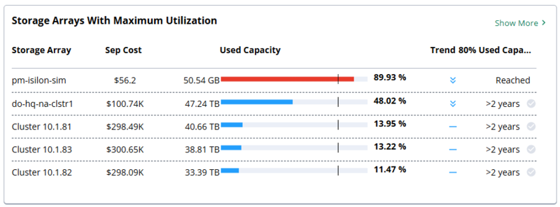 |
The Storage Arrays With Maximum Utilization panel contains the following columns:
Column | Description |
|---|---|
Storage Array | The name of the storage array. |
Month Cost | The storage cost of the array for the current month, for example, Sep Cost. |
Used Capacity | The used capacity of the array, a utilization bar, and the utilization percentage. The vertical line on the bar marks the 80% utilization threshold. The bar is red when utilization is at or above 80%, and blue when it is below 80%. |
Trend | An icon that shows the direction of the used capacity trend for the array. |
80% Used Capacity | The forecast of when the array will reach 80% utilization, such as Reached or >2 years. |
Cost and capacity summary window for maximum utilization
When you click Show More on the Storage Arrays With Maximum Utilization panel, the Cost And Capacity Summary window opens with data for individual storage arrays. By default, the window groups data by Name, shows the current month, and sorts storage arrays by Most Utilized, so the most utilized array appears first. Unlike the panel, which shows only five storage arrays, the window shows all storage arrays that match the current filters.
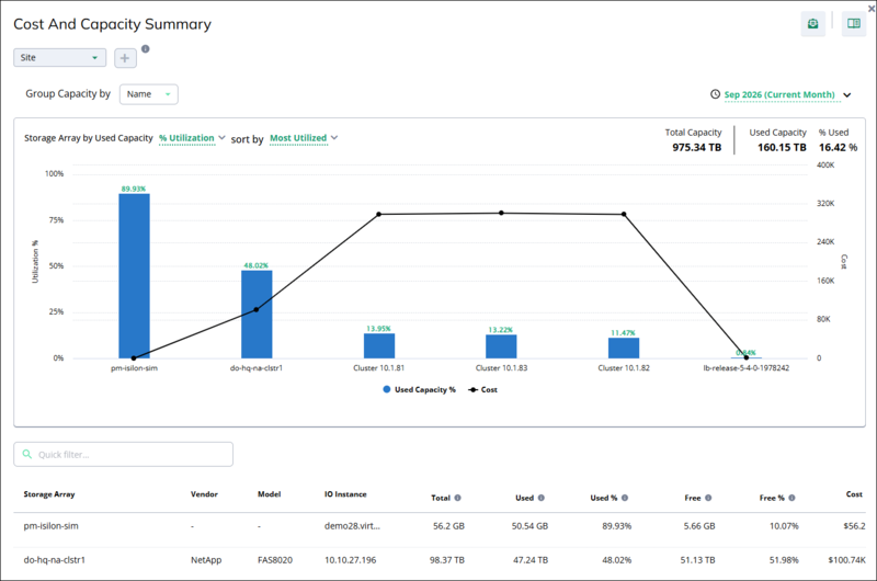 |
The Cost and Capacity Summary window for maximum utilization contains the following controls and elements:
Options | Description |
|---|---|
Add filter + | Filter the window by site, vendor, and other attributes. |
Group Capacity by | Groups the chart and table by an attribute. The default for this window is Name, which shows one item for each storage array. |
Time period | Selects the month to show. By default, the window shows the current month. |
Chart metric | Selects the capacity metric that the chart bars show, for example, % Utilization. |
sort by | Sorts the chart and table. The default for this window is Most Utilized. Select Least Utilized to reverse the order. |
Total Capacity, Used Capacity, and % Used | Summary values for all storage arrays in the window. |
Chart | Shows one bar for each storage array, from the most utilized to the least utilized. The bar height and the label above the bar show the used capacity percentage (left axis). The black line shows the cost of each storage array (right axis). |
Chart tooltip | Appears when you point to a bar. Shows the Total Capacity, Used Capacity, Utilization, and Cost of the storage array. |
Quick filter | Filters the table rows by the text that you enter, such as a storage array name. |
When the window is grouped by name, the table shows one row for each storage array and contains the following columns:
Column | Description |
|---|---|
Storage Array | The name of the storage array. |
Vendor | The vendor of the storage array. A hyphen (-) means that the vendor is unknown. |
Model | The model of the storage array. A hyphen (-) means that the model is unknown. |
IO Instance | The Infrastructure Observability (IO) instance that monitors the storage array. |
Total | The total capacity of the storage array. |
Used | The used capacity of the storage array. |
Used % | Used capacity as a percentage of total capacity. |
Free | The free capacity of the storage array. |
Free % | Free capacity as a percentage of total capacity. |
Cost | The storage cost of the storage array for the selected month. |
To review the storage arrays that are closest to running out of space, do the following:
On the Storage Arrays With Maximum Utilization panel, click Show More. The Cost And Capacity Summary window opens, grouped by name and sorted by Most Utilized.
Review the first bars in the chart. These storage arrays have the highest utilization.
Point to a bar to view the total capacity, used capacity, utilization, and cost of that storage array.
In the table, check the Free and Free % columns to see how much capacity remains on each storage array.
Optional: To find a specific storage array, enter its name in Quick filter.
Storage arrays with minimum utilization panel
The Storage Arrays With Minimum Utilization panel lists the five storage arrays with the lowest utilization (used capacity as a percentage of total capacity). Use this panel to find underused storage arrays, so you can reclaim unused capacity, redistribute workloads, or avoid buying new storage.
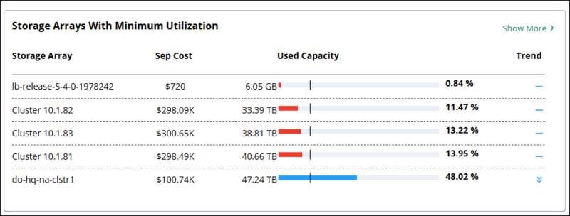 |
The Storage Arrays With Minimum Utilization panel contains the following columns:
Column | Description |
|---|---|
Storage Array | The name of the storage array. |
Month Cost | The storage cost of the array for the current month, for example, Sep Cost. |
Used Capacity | The used capacity of the array, a utilization bar, and the utilization percentage. The vertical line on the bar marks the low-utilization threshold. The bar is red when utilization is below the threshold, and blue when it is above the threshold. |
Trend | An icon that shows the direction of the used capacity trend for the array. For icon meanings, see ???. |
Tip
A storage array with low utilization and a high monthly cost is a good candidate for workload consolidation. Compare the Used Capacity and Month Cost columns to find these arrays.
Cost and capacity summary window for minimum utilization
When you click Show More on the Storage Arrays With Minimum Utilization panel, the Cost And Capacity Summary window opens with data for individual storage arrays. By default, the window groups data by Name, shows the current month, and sorts storage arrays by Least Utilized, so the least utilized array appears first. Unlike the panel, which shows only five storage arrays, the window shows all storage arrays that match the current filters.
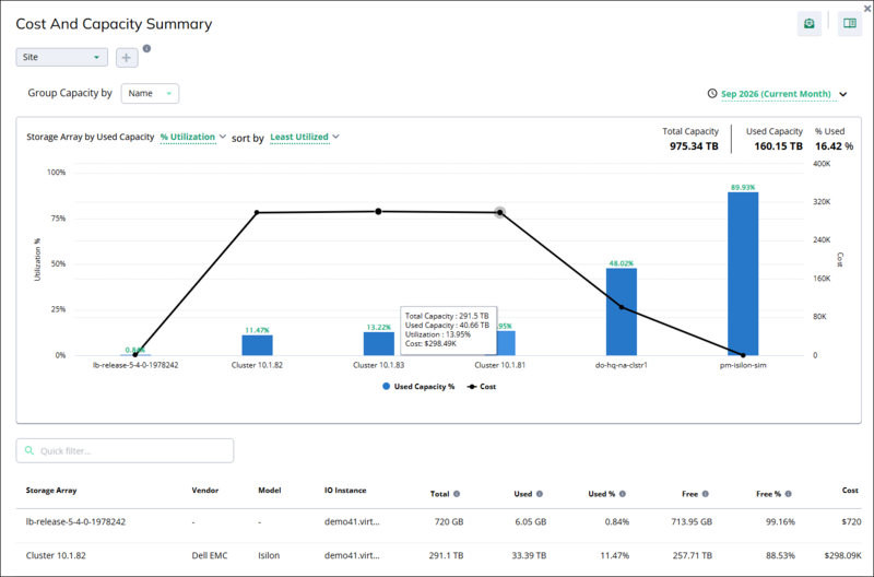
The Cost and Capacity Summary window for minimum utilization contains the following controls and elements:
Options | Description |
|---|---|
Add filter + | Filter the window by site, vendor, and other attributes. |
Group Capacity by | Groups the chart and table by an attribute. The default for this window is Name, which shows one item for each storage array. |
Time period | Selects the month to show. By default, the window shows the current month. |
Chart metric | Selects the capacity metric that the chart bars show, for example, % Utilization. |
sort by | Sorts the chart and table. The default for this window is Least Utilized. Select Most Utilized to reverse the order. |
Total Capacity, Used Capacity, and % Used | Summary values for all storage arrays in the window. |
Chart | Shows one bar for each storage array, from the least utilized to the most utilized. The bar height and the label above the bar show the used capacity percentage (left axis). The black line shows the cost of each storage array (right axis). |
Chart tooltip | Appears when you point to a bar. Shows the Total Capacity, Used Capacity, Utilization, and Cost of the storage array. For example, Cluster 10.1.81 shows 291.5 TB total capacity, 40.66 TB used capacity, 13.95% utilization, and $298.49K cost. |
Quick filter | Filters the table rows by the text that you enter, such as a storage array name. |
Table | Shows capacity and cost details for each storage array. The table has the same columns as the Cost And Capacity Summary window for maximum utilization: Storage Array, Vendor, Model, IO Instance, Total, Used, Used %, Free, Free %, and Cost. |
To find underused storage arrays that you can consolidate, do the following:
On the Storage Arrays With Minimum Utilization panel, click Show More. The Cost And Capacity Summary window opens, grouped by name and sorted by Least Utilized.
Review the first bars in the chart. These storage arrays have the lowest utilization.
Compare the bars with the cost line to find storage arrays with low utilization and high cost.
Point to a bar to view the total capacity, used capacity, utilization, and cost of that storage array.
In the table, check the Free and Cost columns to estimate how much unused capacity you pay for on each storage array.