Create a report
Use this procedure to create a report and add charts to it.
Navigate to the Reports tab and click New Report.

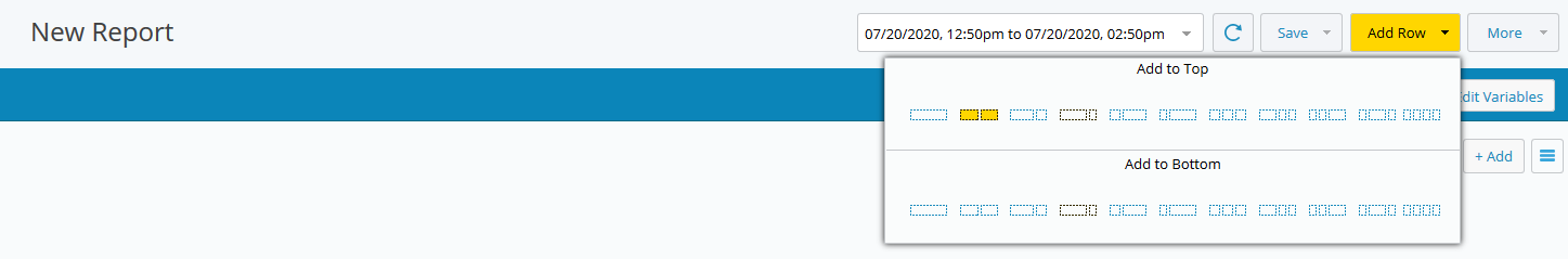
Click Add Row, then select the row layout.
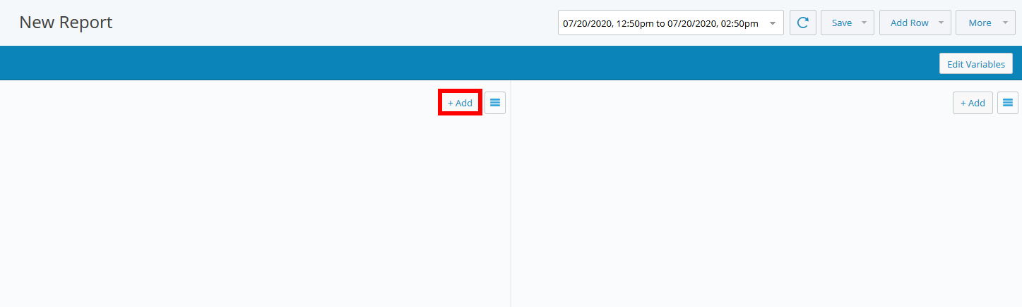
The chart areas are initially blank.
Click Add.
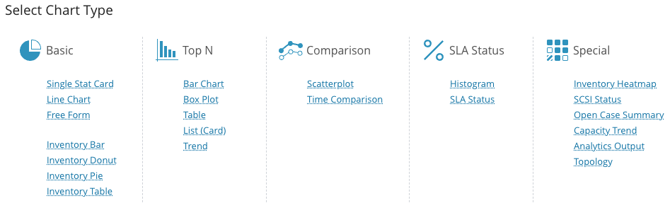
In the chart type selection dialog, select the chart type you want to add to the report.
Note
In IO (Infrastructure Observability) 2026.2.1, reports that include inventory tables are exported as CSV files. This format supports scheduled report runs and email delivery. Reports that contain multiple tables are delivered as a ZIP file, with each table in its own CSV file.
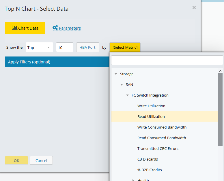
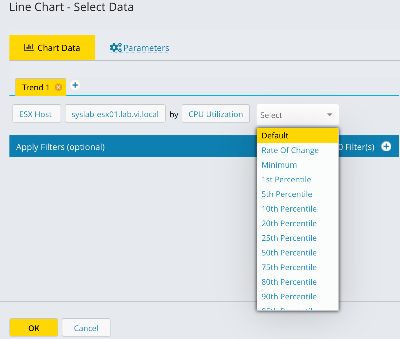
Select the entities and metrics for the report.
The chart type determines which entities and metrics you can select.
The entities and metrics available depend on your configured integrations. If an integration is not configured, the entities and metrics for that integration are not available for selection.
Click in the entity field and select an entity type from the drop-down list. You can use the search field to quickly find an entity type.
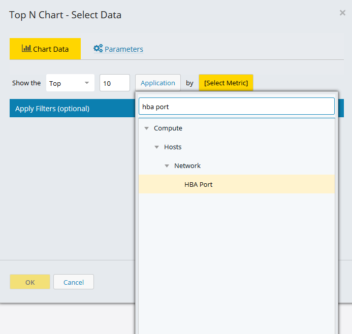
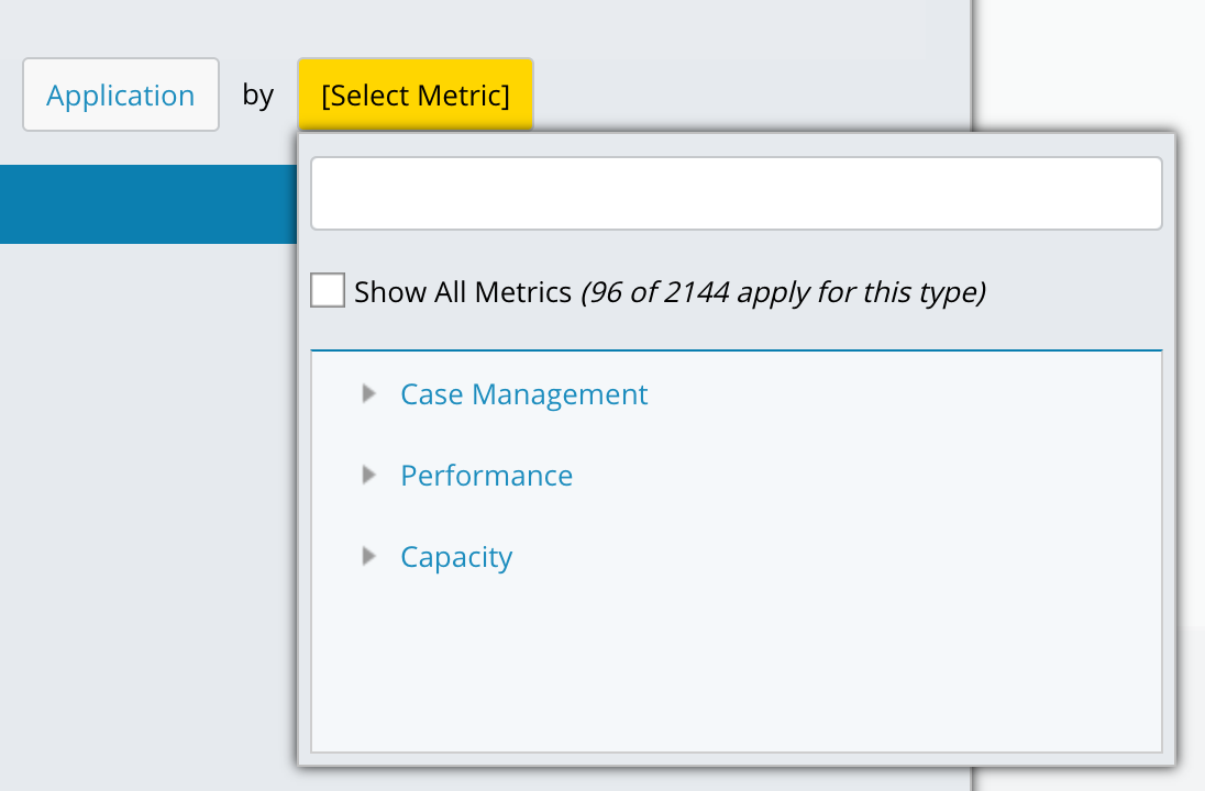
Select a metric from the list of available metrics and click OK.
When you select Application as the entity type, you can choose to display all metrics or only metrics specific to the Application entity. Selecting the Application-specific option filters the list to show only entities assigned to at least one application. Unassigned entities are excluded. The total number of applicable metrics appears in the selection window.
Tip
If you plan to add entity types to an application later and want to configure your report, dashboard, or alarm to include those metrics in advance, select the Show All Metrics checkbox to make them available for selection.
The chart updates with entity and metric data for the selected date range.
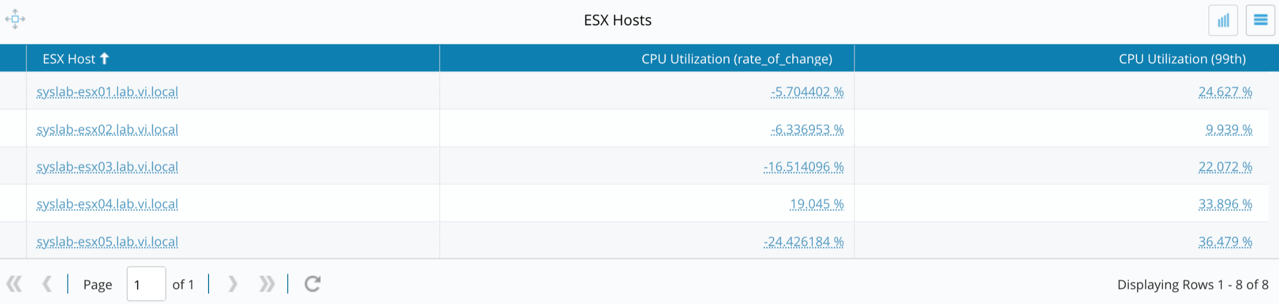
Percentile metrics and rate of change
IO captures percentile values for supported metrics. When you configure a chart, you can select percentile values and view the rate of change for a metric.
Rate of change indicates the direction and magnitude of change for a metric over a selected time range. It is calculated from the start and end percentile values stored in the database for the selected period.
The following rules apply to rate of change values:
A positive value indicates the metric is increasing over time.
A negative value indicates the metric is decreasing over time.
Availability
Rate of change is not available for all metrics. The Rate of Change option appears in the chart configuration panel only when the selected metric supports percentile values.
If the selected metric supports percentiles, the Rate of Change option appears in the chart configuration panel.
If the selected metric does not support percentiles, the Rate of Change option is not displayed.
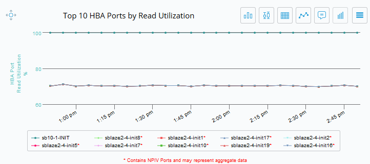
Rate of change is available for the following chart types:
Top-N Trend
Line chart
Top-N table
Inventory table
Trend plot display options
For the Top-N Trend chart and the line chart, you can select what the trend plot displays. The following options are available:
Default summary values: Displays the default aggregated metric summary.
Percentile values: Displays percentile data points (for example, the 95th percentile) for the selected metric.
When you select Percentile values, the plot also displays the rate of change summary value and percentile metric for the chart.
Note
If no display option is selected, the chart fetches data from the summary table by default. If you clear the selection when editing the chart later, you must reselect an option to regenerate the percentile chart.
Chart parameters
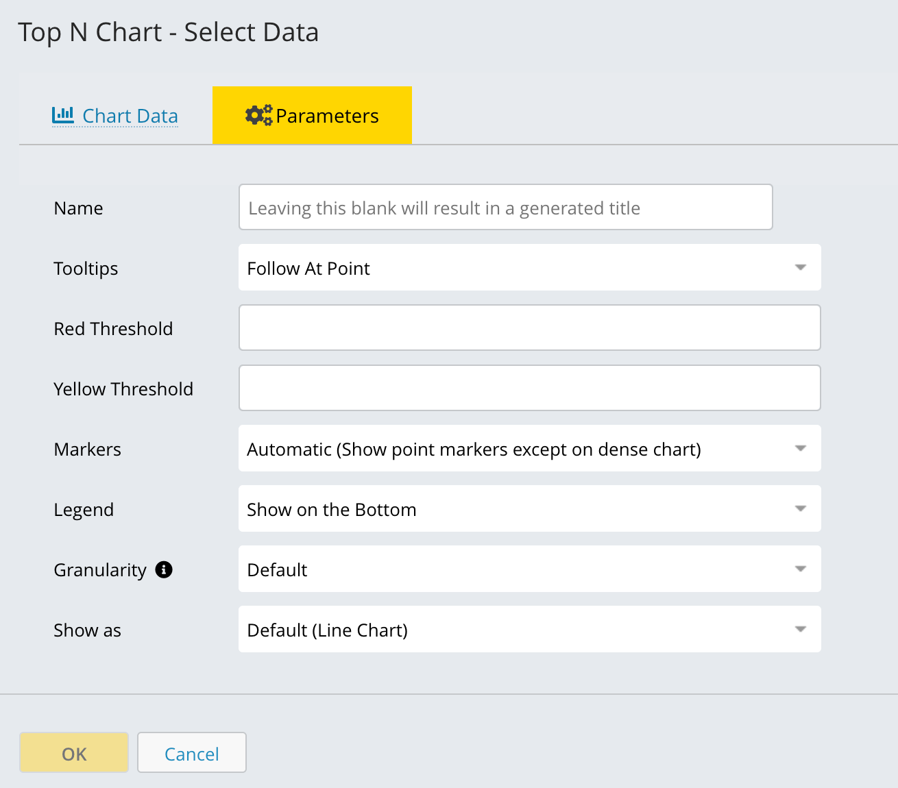
You can configure several parameters for any chart type. Access these options on the Parameters tab in the data selection modal.
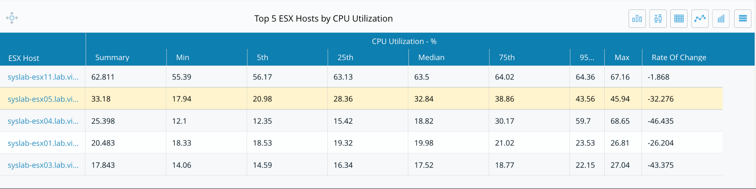
The configurable options include setting an automatic or custom chart name, setting thresholds, specifying the number of entities to display (such as the top 10), modifying the sort order, incorporating a report variable into the chart name, and selecting the display location for tooltips and legends.
The following example shows a chart where you can specify a variable for the chart name, select the number of top entities to display, and change the sort order.
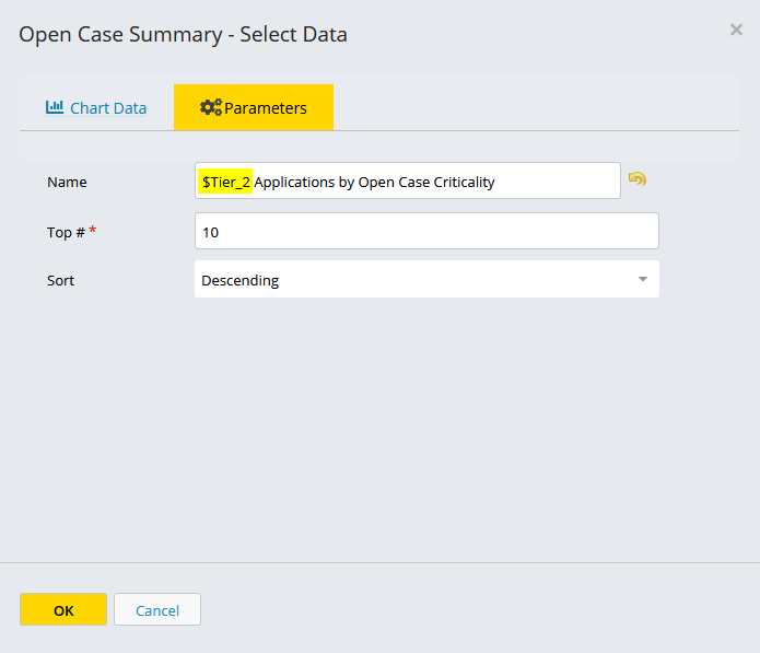
To reset the default chart name, click the back arrow next to the Name field.
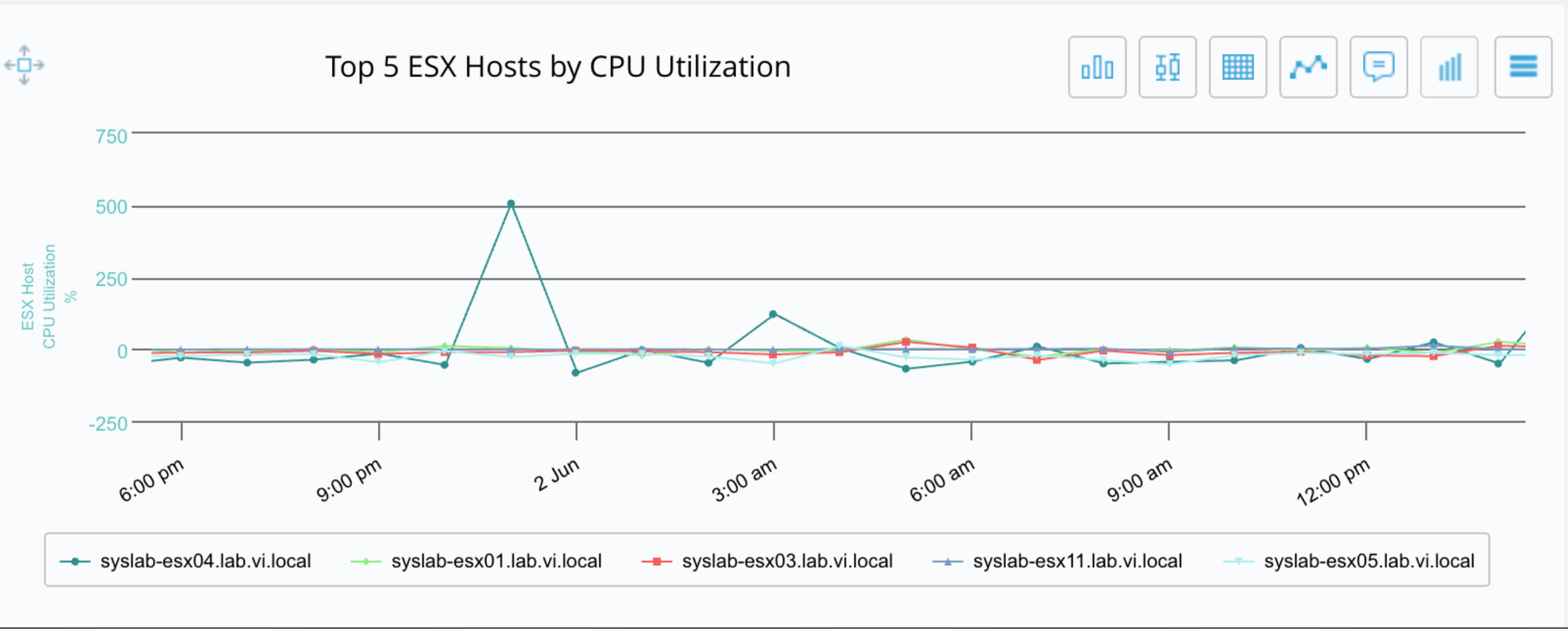
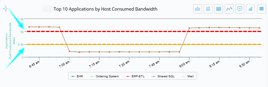
Thresholds
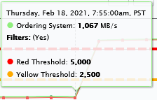
Some chart types, including Top-N Trend, Line Chart, and Inventory Heatmap, let you set thresholds that appear as yellow and red lines on the chart. In the following example, both thresholds are set so you can see where observed data exceeds a user-defined limit.
The yellow and red threshold lines appear on the chart.
Important
Threshold lines have no unit. The system interprets the threshold value based on the unit of the plotted metric. For example, a threshold set to 10 represents 10 GB if the metric is in GB, or 10% if the metric is a percentage.
In charts that display multiple metrics, such as a line chart, the following applies:
Threshold lines apply only to the first metric listed.
If multiple metrics share the same unit type (for example, two GB metrics), you can use Linked Axes Mode to share a single axis. The threshold line still applies only to the first metric.
Note
The y-axis does not always start at zero. The system automatically scales the minimum and maximum y-axis values based on the metric values in the selected time range. If you define yellow or red threshold lines, the chart scales to include them.
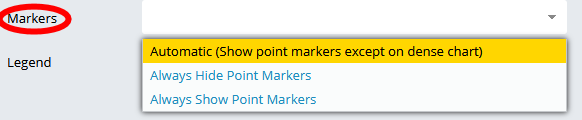
Point markers
You can specify whether point markers appear automatically, are always shown, or are always hidden.
Tooltips
You can specify where tooltips appear on the chart.
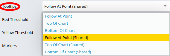
Tooltips appear when you hover over a data point. They show the value for the entity and metric at that point in time.
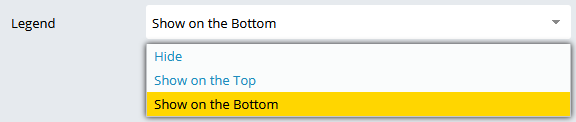
Legend
You can show or hide the legend and select where it appears in the chart.
Granularity
Granularity controls the time resolution at which data is aggregated and displayed. This setting determines how detailed or summarized the chart appears across the selected timeframe.
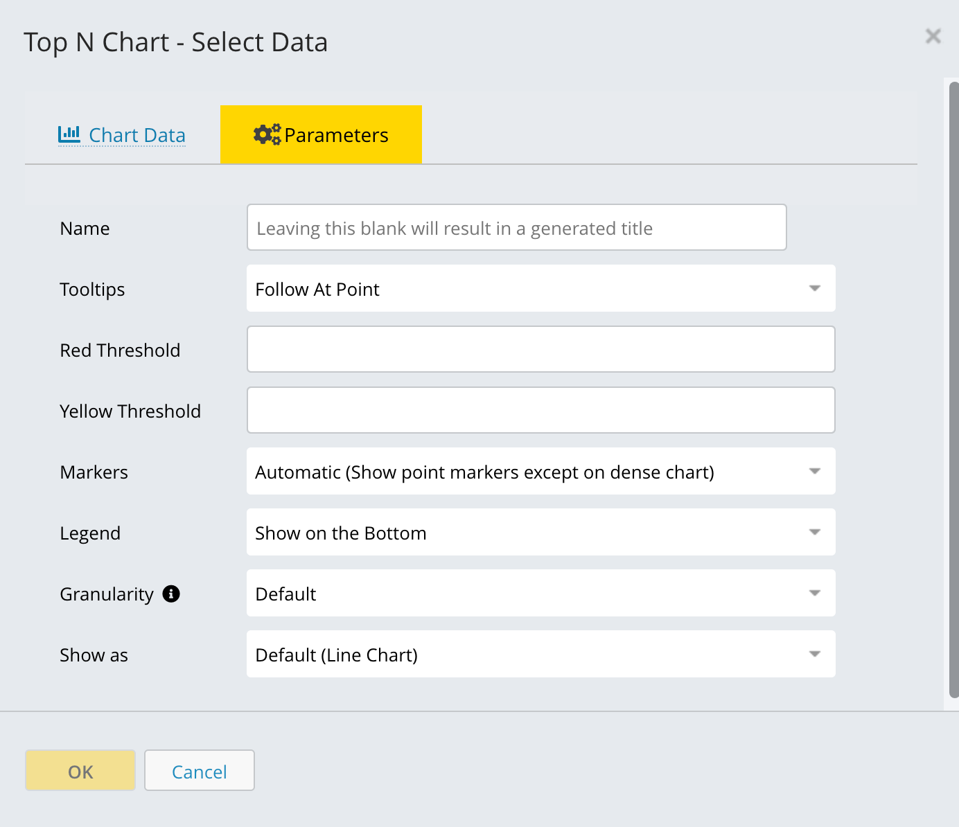
Select a granularity option based on the level of detail you need and the length of the selected time range:
Default: Uses the system-recommended granularity.
Lowest granularity covering timeframe: Uses the coarsest granularity that still covers the selected timeframe.
As collected: Shows data exactly as collected, with no aggregation.
1-hour resolution: Aggregates data into 1-hour intervals. Useful for identifying hourly trends.
5 minute: Finest resolution. Ideal for short timeframes that require high detail.
10 minute: Moderate resolution for near-real-time trend analysis.
4 hour: Coarser aggregation suited for multi-day views.
1 day: Highest-level summarization for long-range trend comparison.
Show as
The Show as option controls how data is visually displayed in the chart. Selecting the correct display type helps you understand trends, comparisons, and distributions.
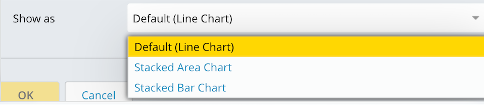
The following display types are available:
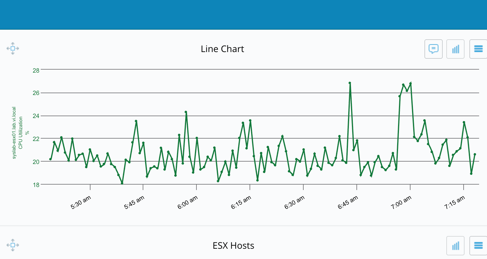
Default (line chart): Displays data as a line over time. Line charts make it easy to spot spikes, drops, and overall performance trends.
Stacked area chart: Displays data as stacked areas, showing how individual components contribute to the total over time. Use this type to highlight total growth and the relative contribution of each component.
Stacked bar chart: Displays data as stacked bars for each time interval. Use this type to compare contributions across time slices without focusing on continuous trends.
Report Filtering
Overview
Report filtering lets you narrow chart and table results to just the entities and data that matter for a specific analysis. By applying entity, data, and pattern-based filters, you can control which entities appear or don’t appear, which metrics are included in calculations, and how properties such as names or tags are matched, so that reports stay focused, performant, and easy to interpret.
Entity filtering
Entity Filtering enables precise control over data aggregation in charts that display multiple entities, such as Top N charts.You can select which specific entities, related to a chart entity, will contribute data to the displayed metrics and calculations.
Once an entity is filtered, all its associated data attributes are used in the aggregation; for instance, filtering by a single application will aggregate data from all related switch ports associated with that application.
Note
Entity filtering is not available for charts that display only a single entity.
Access Entity Filtering
Use entity filters to control which entities appear in a chart and to aggregate data only for those entities.
Configure the chart
Open the chart configuration and set the basic parameters on the Chart Data tab.
|
Entity filter options
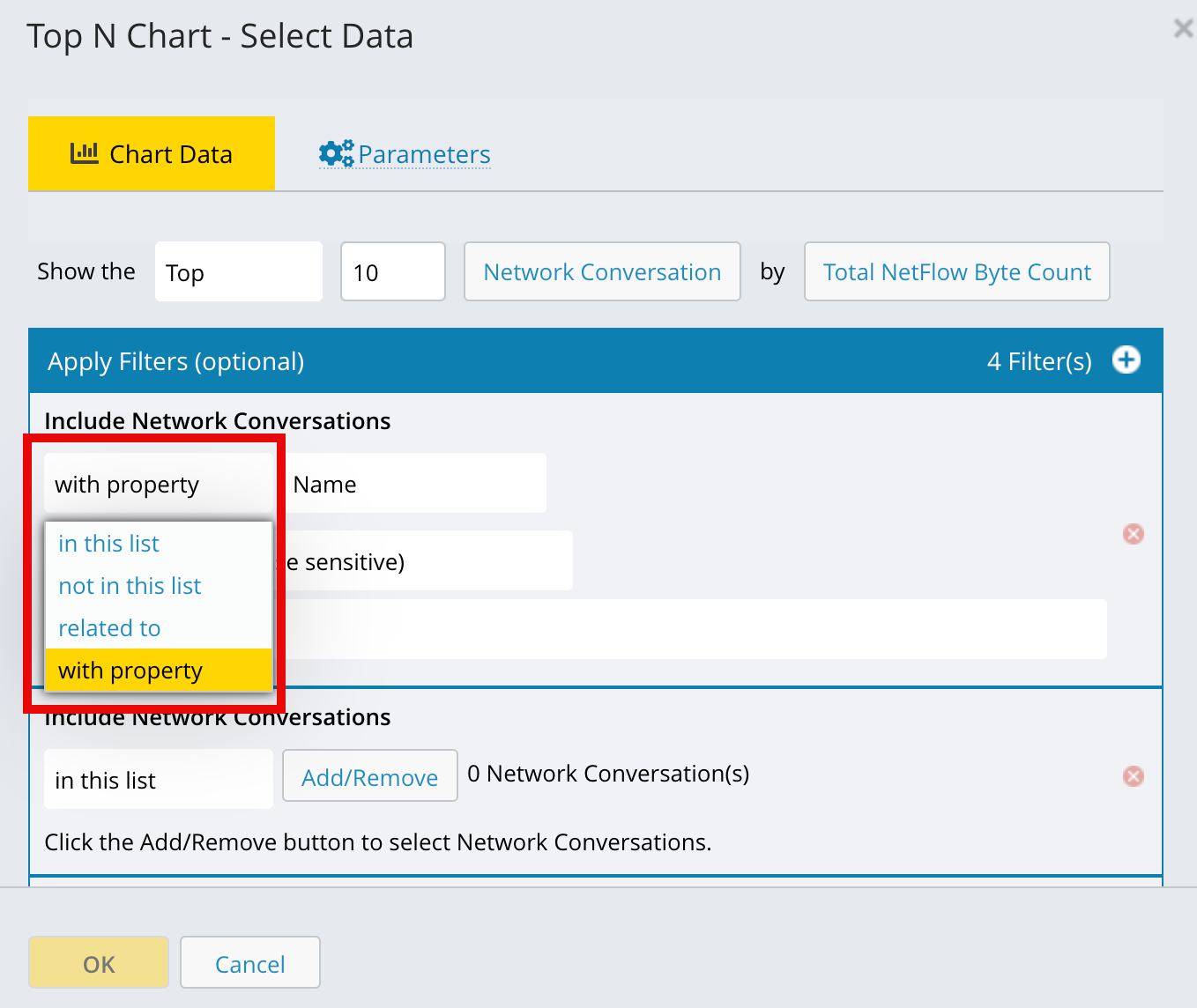
Entity filter options let you control which entities appear in a chart by including, excluding, relating, or property-matching specific entities.
Option | Description |
|---|---|
In this list | Select specific named entities to include. Use the search box to find entities by name, and optionally clear Show Archived to limit the list to active entities. Select the entities and click OK to apply the filter. You can also use template variables in this list. |
Not in this list | Include only entities that are not in the selected list, effectively excluding the entities you choose. |
Related to | Include entities that are related to the chart entity for metric aggregation or calculation. You select the entity from which the search begins—for example, Starting from this host, find the ports. You can also restrict the relationship to a specific topology to improve performance and fine-tune what appears in the chart. |
With property | Filter entities by a system property or tag value, such as including only HBA ports with a port speed of 16 GB. |
With property matching conditions
Pattern-based filters add four new With property conditions that let you include or exclude entities based on whether a property value matches a specified text pattern. These conditions support optional case sensitivity and wildcard matching for text-based properties, such as Name. The new pattern-matching conditions are available wherever existing filter controls are used, including charts, report filter dialogs, rule create and update pages, and other filtering interfaces.
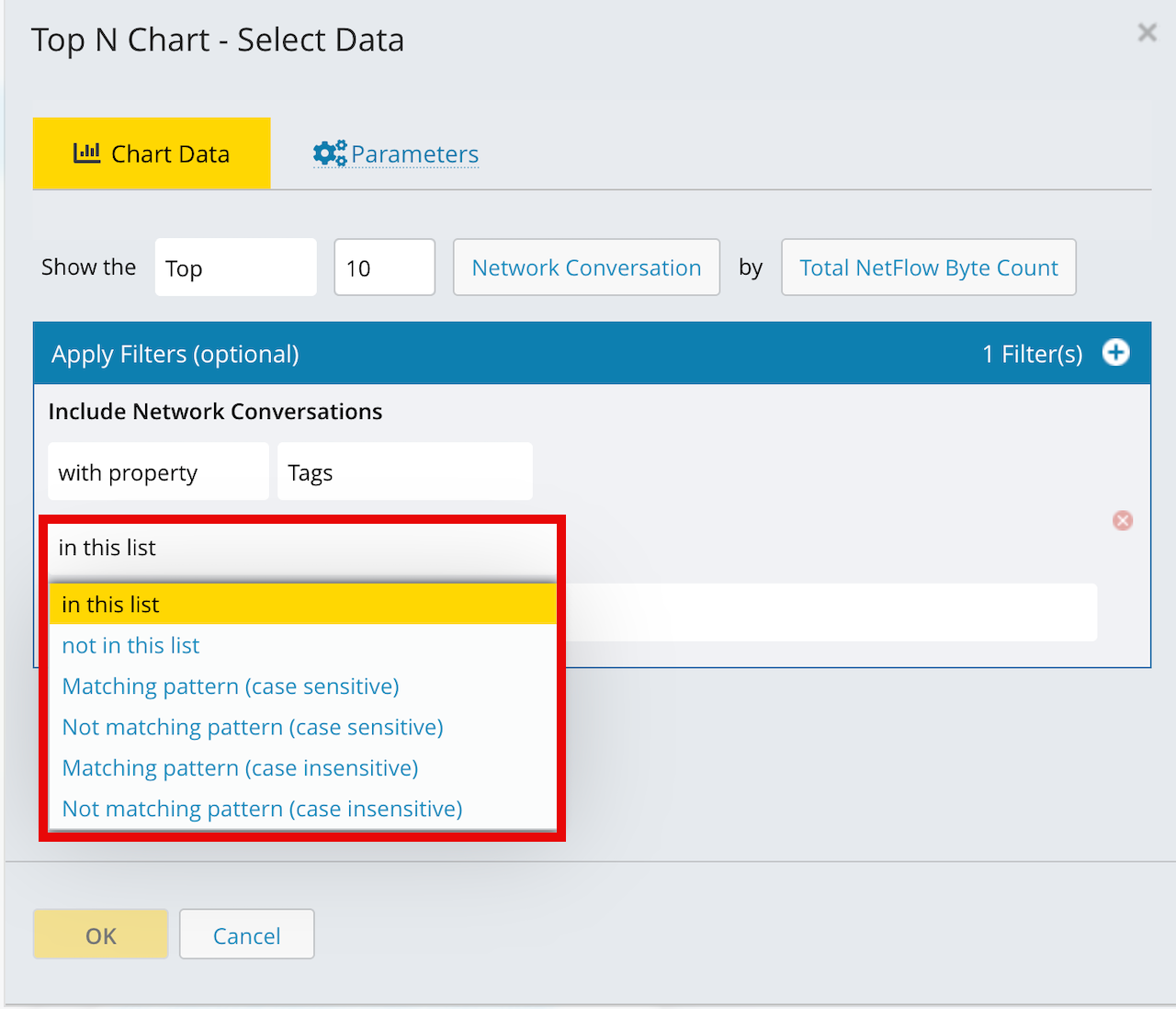
Pattern-based filters let you match entity properties using wildcard text patterns so they can quickly include or exclude groups of items whose names follow a common pattern.
You can refined the filter with pattern-based conditions:
Condition | Matching behaviour |
|---|---|
Matching pattern (case sensitive) | Includes entities whose property matches the pattern, including letter case. |
Not matching pattern (case sensitive) | Excludes property values that exactly match the pattern, including letter case. |
Matching pattern (case insensitive) | Includes property values that match the pattern without considering letter case. |
Not matching pattern (case insensitive) | Excludes property values that match the pattern without considering letter case. |
Note
For optimal performance, especially when your report includes large datasets - it is recommended to use the following filter operators:
Matching pattern (case sensitive)
Not matching pattern (case sensitive)
Data filtering
Data filtering limits the metric calculation to specific entities and their data, instead of using all related entities.
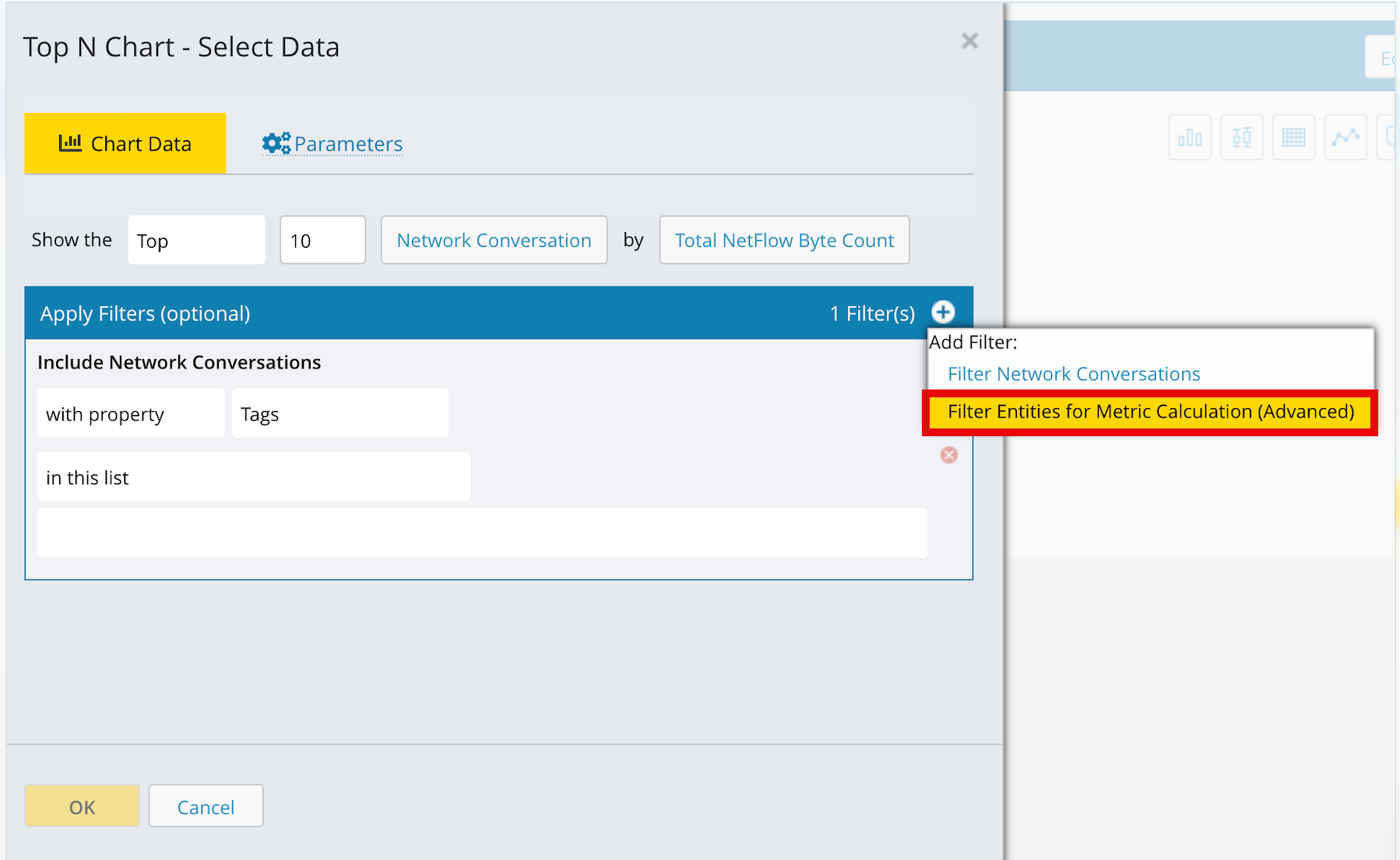
In charts, only the selected entity and metric are included in the aggregation (for example, one application using data from two specific switch ports).
Data filtering is available on all charts, and on Top N charts only when a binding exists between the entity type and the chosen metric (for example, Switch Port–Consumed Bandwidth).
To add a data filter, select the + icon in the chart and choose Filter Entities for Metric Calculation (Advanced).
Option | Description |
|---|---|
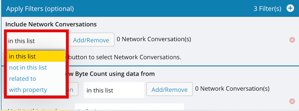
In this list | Include metric data only from the named entities or report variable values you select. |
Not in this list | Include metric data only from entities that are not in the specified list; you can also use a report variable. |
Related to | Include metric data only from entities that have a defined relationship to the chart’s primary entity, optionally driven by a report variable. |
With property | Include metric data only from entities whose system properties or tags match the specified value (for example, applications in the Platinum tier). |
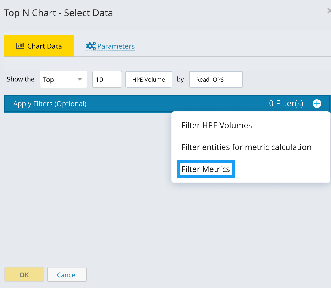
Filter Metrics
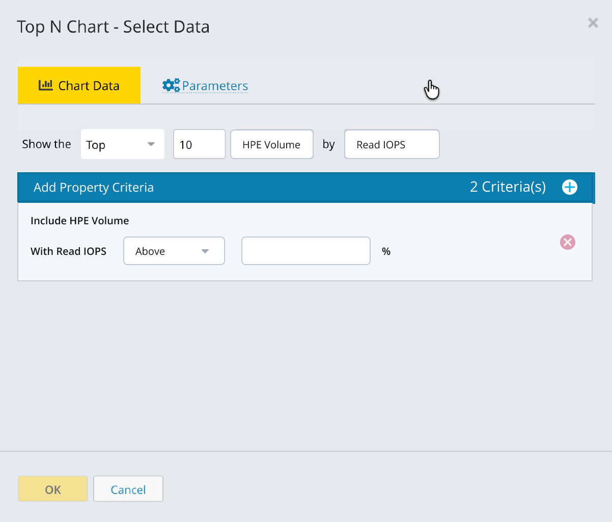
The Filter Metric lets you include or exclude entities based on their metric values over a selected time range. Use this filter when you want reports to return only entities that meet a specific condition - for example, volumes where Read IOPS = 0 and Write IOPS = 0.
Why use Filter Metric
When you use Top N or Bottom N charts, the system ranks entities based on their metric values. Top N displays the entities with the highest metric values, while Bottom N displays the entities with the lowest metric values within the specified limit. Bottom N ranks results comparatively and does not filter by value; therefore, the returned entities may include non-zero metric values.
The Filter Metric resolves this limitation by applying an explicit condition to a metric, such as equals 0, ensuring accurate results.
Note
Top N and Bottom N charts rank entities based on metric values, but do not guarantee that only entities with exact zero values are returned.
To explicitly include or exclude entities based on metric values, apply a Filter Metric.
Filter Metrics are evaluated using the aggregated metric value calculated for the selected time range (for example, Average, Maximum, or Minimum, depending on the metric definition).
The filter does not evaluate individual time-series data points. As a result, entities are included or excluded based on the aggregated value, not on whether any single data point meets the filter condition.
Configure the Metric Filter
Follow these steps to apply a Filter Metric to a report:
From the Report page, click Add New Report and select Trends.
Open the chart configuration and set the basic parameters on the Chart Data tab.
Set Show the to Top or Bottom.
Enter the number of entities to display (for example, 1–50).
Select the Data Type.
Under By, choose a metric.
In the chart area, click the + icon and select Filter Metric.
Add a filter for the required metric (for example, Read IOPS or Write IOPS).
Set the condition, enter the value, and apply the filter.
Example 2. Display Volumes with Zero I/O ActivityIn this example, the chart is configured to display volumes with no I/O activity:
Under By, select Read IOPS or Write IOPS.
Add filters for:
Average Read IOPS = 0
Average Write IOPS = 0
With these filters applied, only volumes with zero average read and write IOPS are included in the chart.
Note
Line charts display filtered values exactly (for example, 0 IOPS).
Trend charts average data across time intervals, so values may appear slightly different.
Pattern Syntax
What is Pattern Syntax?
Pattern syntax is a filtering mechanism in Virtana Infrastructure Observability that allows you to include or exclude data based on text patterns. It provides flexible matching options to refine your report data by searching for specific text strings within properties like Tags, Names, or other attributes.
Available Pattern Matching Options:
in this list - Matches items that are in a specified list
not in this list - Excludes items that are in a specified list
Matching pattern (case sensitive) - Includes items matching a pattern with exact case
Not matching pattern (case sensitive) - Excludes items matching a pattern with exact case
Matching pattern (case insensitive) - Includes items matching a pattern regardless of case
Not matching pattern (case insensitive) - Excludes items matching a pattern regardless of case
Boolean Operators for Advanced Filtering:
or - Combines multiple conditions (any can be true)
union - Internal OR-like operator for embedded relationships
After you select a pattern matching option (like "Not matching pattern (case sensitive)"), you'll see a text input field where you need to enter your pattern.
This field is where you type your search pattern using:
Regular text
Boolean operators (|)
Wildcard symbols (*, ?)
Pattern Matching Symbols
Use pattern matching symbols to create flexible filters that match multiple entities based on common naming patterns in your infrastructure.
Asterisk (*) - Match Zero or More Characters
Symbol | What It Does | Where to Place It |
|---|---|---|
* (asterisk) | Matches zero or more characters of any type (letters, numbers, symbols). Use this to match entities that share a common prefix, suffix, or middle portion in their names. The matched characters are known patterns in your environment—the asterisk simply allows you to match all variations efficiently without listing each one individually. |
|
Example
Pattern | What It Matches | Use Case |
|---|---|---|
prod-* | prod-web, prod-, prod-app, prod-db-01, prod-server-east-001 | Prefix match: All entities starting with "prod-" (including "prod-" itself with zero characters after). |
*-backup | server-backup, db-backup, storage-array-backup | Suffix match: All entities ending with "-backup" |
*-tier1-* | prod-tier1-web, dev-tier1-app, storage-tier1-ssd | Middle match: All entities containing "-tier1-" anywhere in the name |
prod-*-01 | prod-web-01, prod-app-01, prod-database-01 | Prefix and suffix match: All production entities ending with "-01" |
Question Mark (?) - Match Exactly One Character
Symbol | What It Does | Where to Place It |
|---|---|---|
? (question mark) | Matches exactly one character of any type—letters, numbers, or symbols. This is useful when you need to match a single variable character in a specific position while keeping the rest of the pattern fixed. |
|
Example
Pattern | What It Matches | Use Case |
|---|---|---|
server-0? | server-01, server-02, server-0a, server-0X | Single variable character: Matches any single character in the last position (numbers, letters, or symbols) |
host-? | host-a, host-1, host-# | One character variation: Matches any single character after "host-" |
prod-??-web | prod-01-web, prod-xy-web | Two variable characters: Matches exactly two characters in the middle position |
fc? | fc0, fca, fc# | Single trailing character: Matches "fc" followed by any single character. |
?-server-? | b-server-2, 1-server-x | Multiple single positions: Matches one character at the beginning and one at the end |
Pipe (|) - Match Multiple Alternative Patterns
Symbol | What It Does | Where to Place It |
|---|---|---|
| (pipe) | Allows you to define multiple alternative patterns and match entities that satisfy any one of them. This acts as a logical OR operator, letting you combine different patterns in a single filter. |
|
Note
Do not put spaces before or after the pipe (|) unless those spaces are intentionally part of your pattern.
Example
Pattern | What It Matches | Use Case |
|---|---|---|
prod-*|staging-* | prod-web, prod-app-01, staging-db, staging-server-02 | Multiple prefixes : (no spaces): Matches all entities starting with "prod-" OR "staging-" |
*-web|*-app|*-db | server-web, host-app, storage-db | Multiple suffixes: Matches entities ending with "-web" OR "-app" OR "-db" |
prod *|staging * | rod server, prod web, staging app , staging db | With intentional spaces: Matches "prod " (with space) OR "staging " (with space) |
server-0?|host-0? | server-01, server-0a, host-01, host-0x | Combined with other symbols: Matches two different patterns with variable characters |
For advanced patterns or troubleshooting, contact Virtana Support team.
Creating Report Variables
Report variables are defined at the report level but used to filter charts. Report variables can be created at any time to an existing report or added when creating a new report.
Some chart types do not allow for use of variables with the primary data selection because you do not select specific entities. An example would the Top N Chart. However, you can still use variables in metric filters for charts, to create relationships in any chart type that allows filtering.
If your report includes chart types that do not specify entities (such as Top N Chart), those charts are not affected by use of a variable on other charts in the report.
You can add multiple variables to a report and associate the variables with various entity types.
Tip
It saves some steps if you first create the variables you want for a report, then select the variables as you add the charts to the report.
Navigate to the Reports or Reports Templates page.
Click New Report or open an existing report.
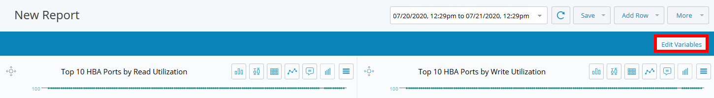
Define new variables for the report by selecting Edit Variables.
Use the + sign to add a new variable.
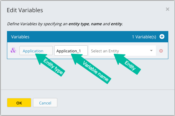
Select the entity type to be used in the variable.
The variable is named automatically but you can change the name using the second field. Only letters, numbers, underscores, and periods are allowed in the name.
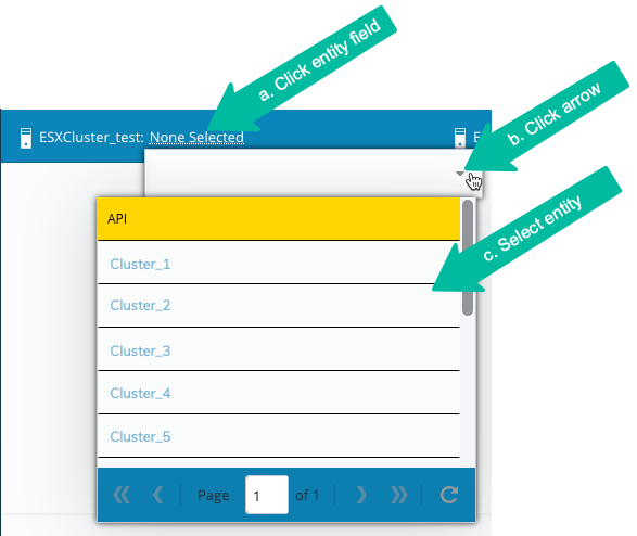
Optional: Select a specific entity value in the third field.
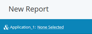
The variable is displayed at the top of the page.
The variable can now be used to filter charts in your report. To add a variable to a chart, click
 to edit the chart.
On the Chart Data Page, select an entity type in the first field.
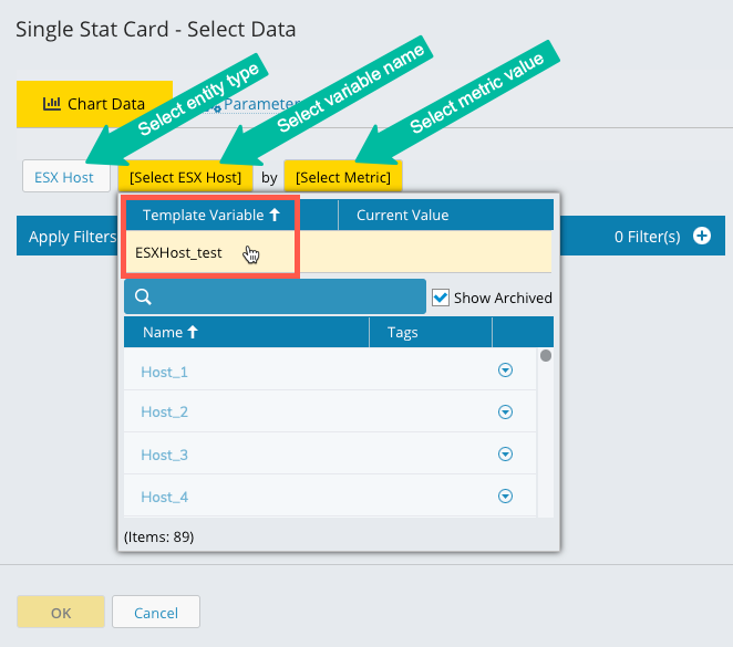
In the second field, select from the list of report variables.
In the third field, select a metric value.
Click OK. The report page displays. You can now populate the report variable and the chart will be filtered for the value selected for the variable.
Changing Report Variables Using a URL
You can change the entity value for a report template variable either from the variable field on the report page, or by passing the entity name in a URL.
Prerequisites
The report you want to work with must have been saved.
The variable name must have been associated with the charts in the report.
You need to know the names of the variable templates you want to use and the names of the entities for which you want to view data.
Steps
Navigate to the Reports or Report Templates page and select a saved report.
The browser URL field displays the static ID of the report in the format:
https://appliance-id/#tab-name/page-name/report-uidThe appliance name/ID + tab/page name + UID = the static URL of the report.
In the URL field, add the variable and entity name after the report ID in the format:
/variable-name=entity-nameExample:
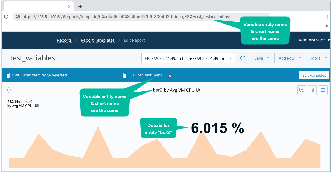
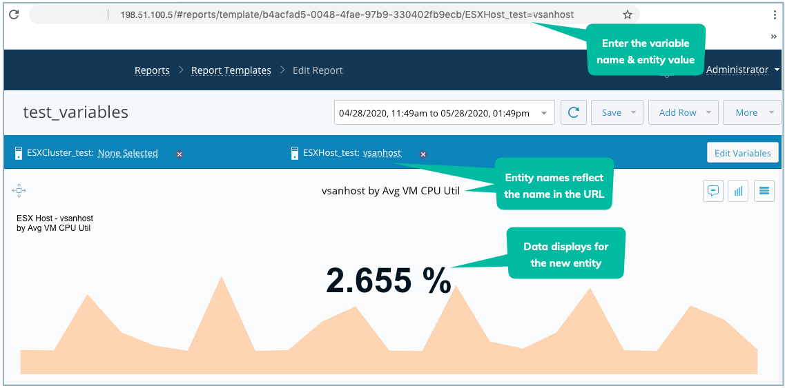
https://198.51.100.5/#reports/template/e9678-123-8910-b23eio/ESXCluster_test=Cluster_1
198.51.100.5 = IP address (or name) of the IO appliance
#reports/template = The names of the tab and the page in the IO UI
e9678-123-8910-b23eio = The UID of the report
ESXCluster_test = The template variable name
Cluster_1 = The entity value
Click Enter.
The report page updates with the new data and the variable name and entity value display above the charts.
Tip
If you select a different entity using the field in the UI, it updates the data on the page for that entity, but the URL does not change to reflect the new entity name.
The following images show how adding the template variable name and entity value to a report's static URL changes the data displayed in a report.
Adding a Report as tab in Inventory View
To add a report as a tab in Inventory, do the following.
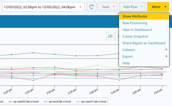
Click More > Show Attributes.
Under Report Attributes.
Select the Show as tab in the entity details page [EntityType] checkbox, where EntityType is the entity type (e.g., ESX Host) selected for the report and related variable, and provide a name for the Inventory tab in the Tab Name field.
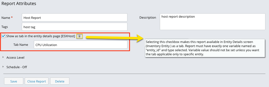
Preview Tab Order: While viewing an Inventory report's attributes and deciding on a tab name, you may preview the tab order by clicking on the Preview Tab Order button to the right of the Tab Name field.
Access Level: Click Add to grant access to users.
Schedule The Schedule feature allows you to generate and send reports at defined intervals automatically.
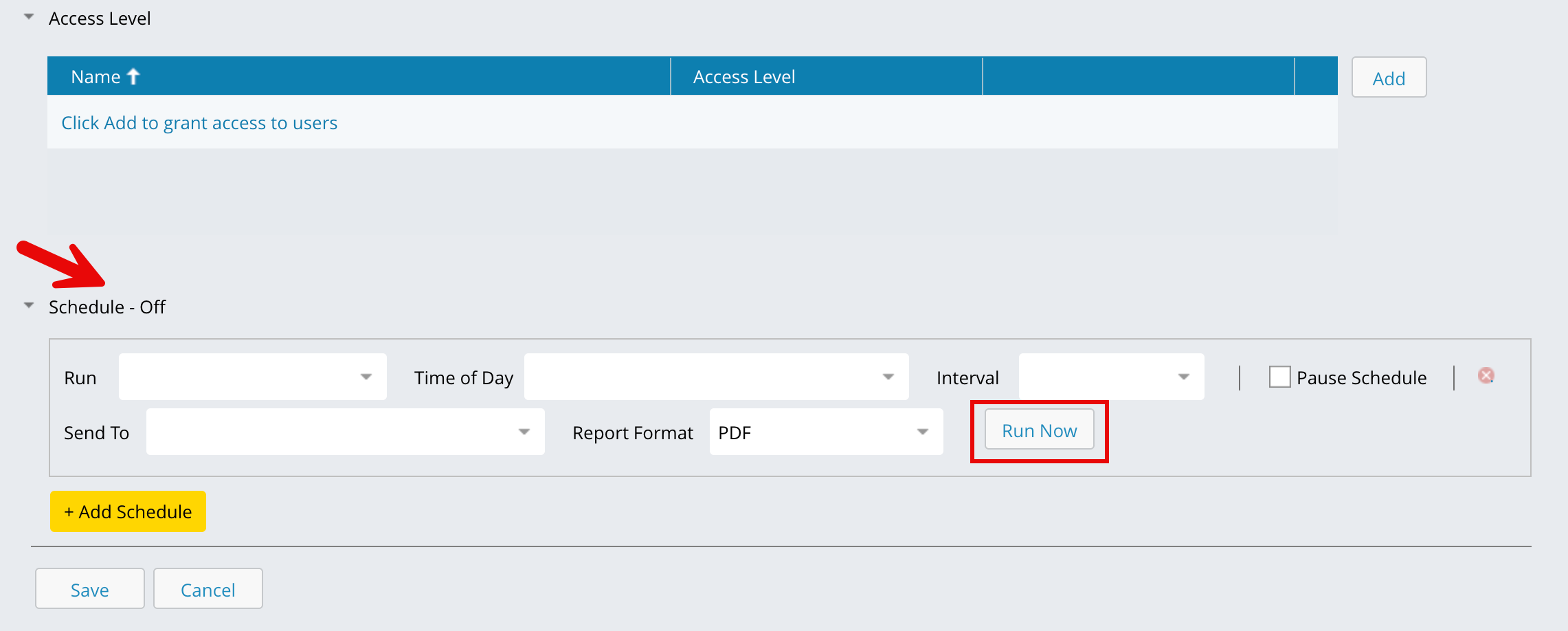
Configure the schedule options:
Run: Select how often the report should run, options include Every Day, Every Other Day, or specific days of the week (for example, Every Monday, Every Friday).
Interval: Select the time range for the data to be included in each report.
Send To: Choose the recipients who will receive the generated report.
Report Format: Select the file format for the report — PDF, PNG, or SVG.
Pause Schedule: Enable this option to temporarily stop report generation without deleting the schedule.
Click Run Now to generate the report immediately without waiting for the next scheduled time.
The Run Now feature allows you to instantly create a scheduled report and send it to your registered email address, even if a regular schedule is already set for that report.
Note
Before using the Run Now option, ensure that the outbound email service is enabled in your system settings. This allows the system to successfully deliver the report to your inbox.
Click Save. The system will automatically generate and send the report based on your defined schedule.
Results Sets
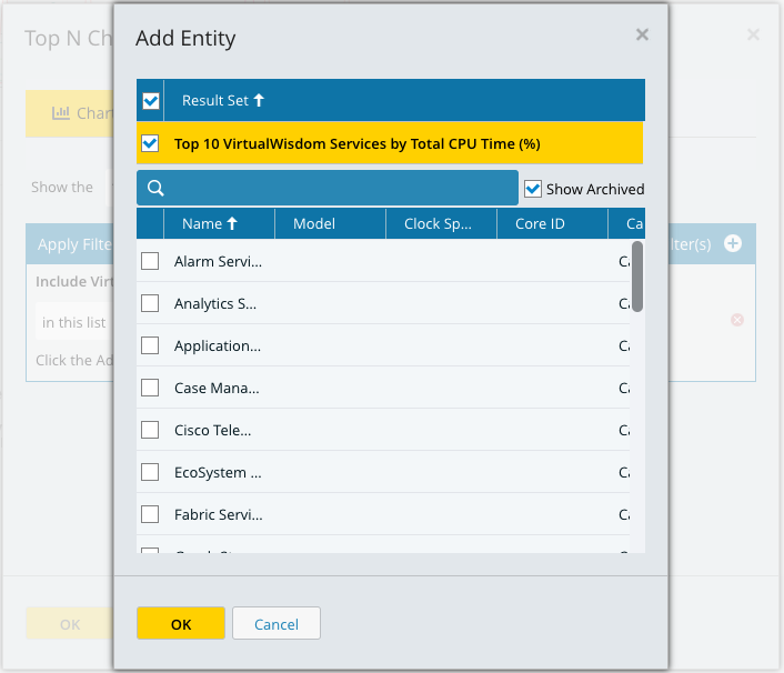
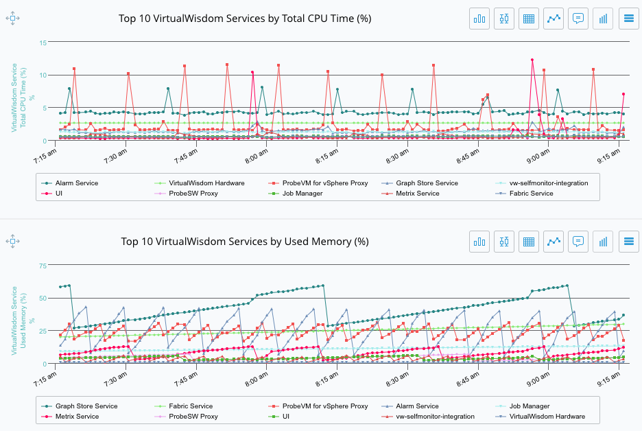
Results sets is a chart capability that provides for using the results of a Top N or Inventory chart, that is, the entities returned, as a basis for another Top N or Inventory chart.
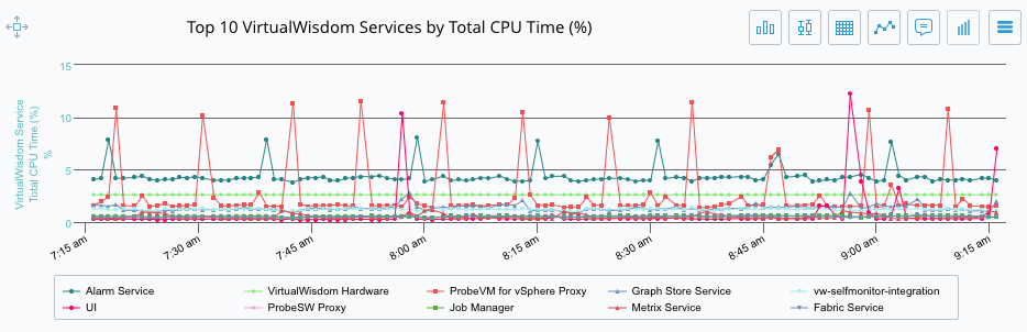
Suppose you want to find the Top 10 IO Services consuming the most Appliance CPU. Then, from those results, you want to find the services consuming the most Appliance memory. You would follow these steps.
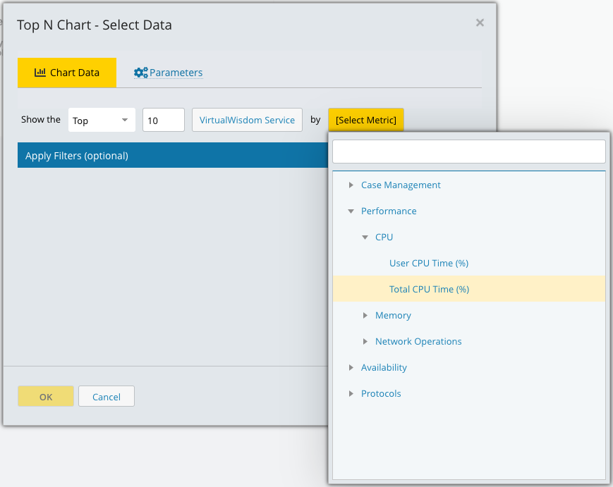
Create a new Report and add a Trend chart to the empty row. Choose IO Service as the entity type and then choose Total CPU Time (%) as the metric (see the leftmost image below). Click OK to display the chart (see the rightmost image below).
Add a second row and add a Trend chart to the empty row. Choose IO Service as the entity type and then choose Used Memory (%) as the metric. Now apply a filter of type Filter IO Services. Click on Add/Remove and then check the box next to the first chart you created in step 1 (see the leftmost image below). Click OK and then click OK again to display the two related charts (see the rightmost image below).