 Anomalies tile
The Anomalies tile shows entities in the dashboard’s scope that have the highest number of anomalies during the current time range. Anomalies are identified by analyzing the data points of metrics.
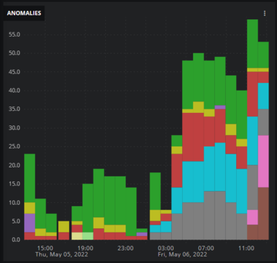
The default view includes a visualization (a column chart) of the sums of anomaly counts over time and a table of the most anomalous entities. You can configure the view to display just the visualization or just the table. In the table, entity names are links to the entity’s Smart View page.
To create a chart, Virtana Service Observability divides the current time range into 24 equal periods and then represents the total number of anomalies during each period with separate columns (or no column).
Example tiles
Default view
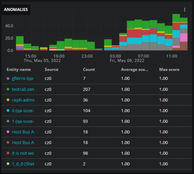
Table view
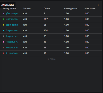
Chart view
Tile configuration options
You can set the following properties for this tile.
Tile title
The text that appears in the upper-left corner of a tile.
Max entities displayed
The maximum number of entities to display in the tile.
In chart or combined view, the maximum is 16.
In table view, the maximum is 30.
In table view, the number of rows is truncated to fit the tile, if necessary, and entities are displayed in descending order, from most to least anomalous.
Order by
The criteria to use to include entities in the tile.
Count: Entities with the highest number of anomalies
Average score: Entities with the highest average anomaly scores.
Max score: Entities with the highest maximum anomaly scores
Show
Toggle controls for enabling or disabling a view. The default is to display both views.
Adjust columns
(Optional) The columns to include in the table. This option is not visible when table view is not selected.