 Graph tile
The Graph tile displays diagrams of the relationships among one or more series in the current time range. To create a graph, specify:
For example:
The 1-minute, 5-minute, and 15-minute CPU load averages of one Linux server
The 5-minute CPU load average of all Linux servers in the dashboard’s scope
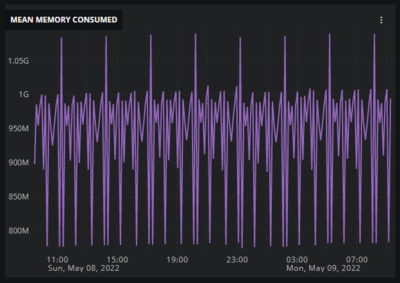
The arithmetic mean of memory used by all Linux servers in the dashboard’s scope
In graphs of multiple series, you can aggregate all the series or display each entity’s series independently. In some combinations, all of the series must be aggregated. In graphs of multiple metrics that use different units of measurements, the vertical axis is unlabeled.
Tip
The dashboard tutorials include an example of creating a Graph tile. Also, you can create a Graph tile quickly from the Metric Dictionary page or any Smart View page. For more information, see Get started with dashboards.
For optimal performance, Virtana recommends limiting graph tiles to two-three metrics per tile.
Example tiles
Take a look at these example tiles to see how different combinations appear in the graph:
One metric, not aggregated
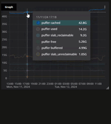
One entity, multiple metrics
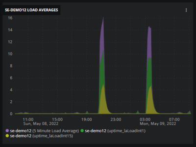
Multiple entities, one metric, discrete display
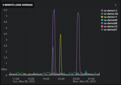
Multiple entities, one metric, aggregated display
Configure your tile
When creating a new dashboard, click the Graph tile type on the AVAILABLE TILES panel on the right side. The GRAPH panel opens on the left side. By default, the TILE CONFIGURATION tab is selected.
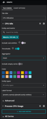
Use the fields in the tile information area to specify one combination of metric and entity to visualize in the tile. When no entity is specified, the tile includes the metric data points of all the entities in the dashboard’s scope that use the specified metric. You can specify any number of entity and metric combinations.
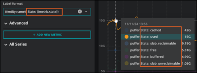
For example, you might want to identify your OpenTelemetry data for a specific metric in the legend of your graph tile. In this case, you can use the Label format field to help you highlight and analyze different metadata. If you set Aggregator to none for an individual metric, you can enter different values in the Label format field using the mustache template system to help you identify the metric metadata in your graph. You can also add additional text to help your users.
Note
For more information about OpenTelemetry metrics, see OpenTelemetry.
Select a visualization type
Use the visualization selector to choose a line chart, bar chart, stacked area chart, or scatter plot.

Tile Configuration
Use the following fields to configure your graph tile:
Tile title
The name of your tile that appears in the upper-left corner of the tile.
Entity and metric
The search field for finding entity and metric names in the dashboard’s scope. If a search term matches both entities and metrics, both are shown in separate lists.
Include sub-entities
A toggle control, to display series associated with child entities of the specified entity. The series associated with the specified entity, if any, is not displayed, nor are any series associated with descendants other than child entities.
Thresholds
(Optional) Hides or displays configured threshold limits in the graph for any applicable metrics. When on, the threshold for the applicable metric appears in the graph as a dashed red line. You can also select Triggers using the More actions menu (⋮) on the tile.
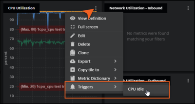
The default is off. This field uses threshold data configured for a metric in Actions. For more information, see Add a metric trigger.
Aggregator
The arithmetic function to use to combine metric data points in the visualization, or select none for no aggregation function. The default is mean.
Include empty series
A toggle control, to hide or display an empty series. A series is empty when no data points are found for a metric during the current time range. The default is to hide empty series.
Color
The color to use in the visualization. This option is only available when both an entity and a metric are specified. When only a metric is specified, visualization color is assigned automatically.
Entity types
(Optional) One or more types of entities to include in the count. Essentially, this is a sub-query of the dashboard’s scope.
This option is not available when an entity is specified in the Entity and metric field.
Label format
The content to include in hover text and in the legend, if enabled. Depending on which aggregator you choose, a different default label format is used and different default label formats are available. This field uses the mustache template system.
If needed, you can enter your own label format in the field by using any combination of metric, entity, and parent entity fields. These can either be entered into the box or selected from the provided list. As you enter text, the list is filtered to only fields that match what you entered.
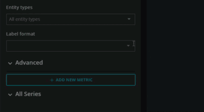
For example, if you want to identify your open telemetry data for a specific metric, you can enter different values in this field using the mustache template system to help you identify the metric metadata in your graph. Entering two open braces ({{) allows for auto-completion of variables.
The values you enter here are also used in the legend, so you can customize it for your users, such as adding helpful text or other notations.
Advanced
The Advanced area provides fields for determining the order in which series appear in graphs of multiple series of the same metric.
The default maximum number of series displayed in a graph is 16. To change the number, see Chart options.
Show me
The ordering to use, either highest (highest to lowest) or lowest (lowest to highest). The default is highest.
Ranked by
The method to use to assign a rank to each series.
Note
Ranking is performed before alignment, which may result in graphs that appear to be ordered incorrectly. For example, if you choose the maximum ranking method and the data alignment option is set to its default, mean, then the series may appear to be out of order. To avoid confusion, set the alignment option to match the ordering method. For more information, see ADVANCED options.
mean | Use the arithmetic mean of all data points in the series. |
maximum | Use the highest data point in the series. |
minimum | Use the lowest data point in the series. NaN values are lower than any numeric value. |
99th percentile | Use the interpolated value that is greater than or equal to 99% of the data points in the series. |
95th percentile | Use the interpolated value that is greater than or equal to 95% of the data points in the series. |
50th percentile | Use the interpolated median value of the data points in the series. |
5th percentile | Use the interpolated value that is greater than or equal to 5% of the data points in the series. |
standard deviation | Use the square root of the mean variance of all data points in the series. |
Align
The method to use to align data points in a single metric’s series.
none | Do not align data points. |
interpolate | Insert data points between adjacent data points around the alignment period boundary. |
next older | Shift the oldest data point before the alignment period boundary to the boundary. |
mean | Use the arithmetic mean of all data points in the series. |
maximum | Use the highest data point in the series. |
minimum | Use the lowest data point in the series. NaN values are lower than any numeric value. |
standard deviation | Use the square root of the mean variance of all data points in the series. |
sum | Replace all data points in the alignment period with the sum of their values. Works with numeric and distribution values. |
count | Replace all data points in the alignment period with the sum of their values. Works with numeric and Boolean values. |
rate | Use the average number of changes per second in the series. Values below zero are discarded. This option is useful for metrics which represent a running count and originate with a streaming data source. |
delta | Use the absolute change in the series, which can be either positive or negative. This option is useful for metrics which represent a running count and originate with a streaming data source. |
All Series
The All Series area provides tile scope filters and two fields for optimizing data point alignment options. The settings in these fields apply to all metric series used in the tile.
The alignment options provide a standardized way to display data points when the amount of space for display and the time range to represent are variable. The defaults for these options are industry best practices.
Chart options
You can select the following chart options for your graph tile:
Legend Position
(Optional) Display a legend in the tile, on the right side or at the bottom of the tile.
When an aggregation function is selected, the legend includes a mnemonic of the aggregation function and the number of entities included in the visualization.
When no aggregation function is selected, the legend includes the names of the highest-scoring entities. Each entity name is a link to the entity’s Smart View page.
Max series displayed
The maximum number of series to display in the tile. The default is 15.
Chart type
For bar charts and area charts, you can specify whether the data is stacked and whether the stacked presentation shows the combined totals of series on the vertical axis or the percentage of each series.
None | Do not stack data points, present them side-by-side. |
Stacked | Stack all data points and extend the vertical axis to the largest sum per horizontal axis timestamp. |
100% Stacked | Interpolate all data points to a minimum of 0 and maximum of 100 on the vertical axis per horizontal axis timestamp. This option is useful when data points are not aggregated, use the same units, and have common timestamps. |