Creating Reports
To create a new report, navigate to the Reports tab and click New Report.

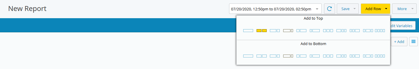
Click Add Row, then select the row layout.
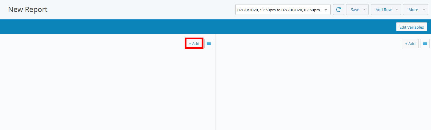
The chart areas are initially blank.
Click Add to choose a chart type to add to the report.
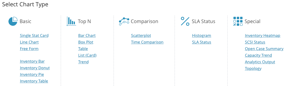
Select the chart type you want to add to the report.
Note
In this release of IO 2026.2.1, reports that include Inventory Tables are now exported as CSV files. This format supports the scheduled running and email delivery of these reports. Reports containing multiple tables will be delivered as a ZIP file, with each table contained in its own CSV file within the archive.
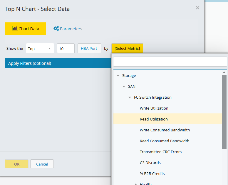
Select report data.
Depending on the chart type, you are prompted to select entities and metrics.
The availability of both depends on the configured integrations. If an integration is not configured, you are not able to select the entities and metrics for that integration.
Select an entity type. Click in the entity field and selecting it from the drop-down list. You can use the search field to quickly find an entity type.
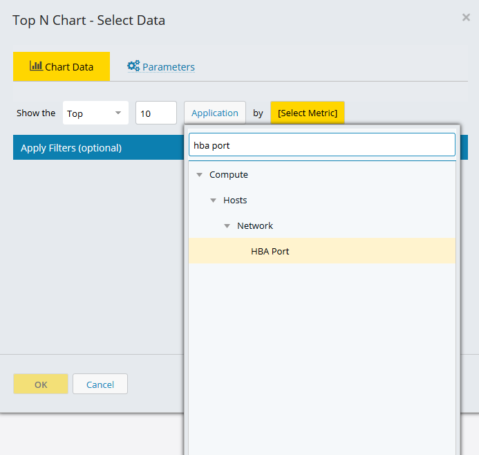
Select a metric in the list of available metrics and click OK.
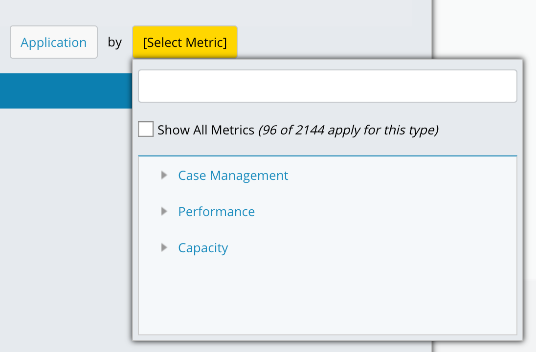
When you select Application as the entity type, you have the option to display all metrics or only those specific to the Application entity. Choosing the latter filters the list to include only entities currently assigned to at least one application, thereby excluding unassigned entities. The total number of applicable metrics is shown within the selection window.
Tip
If you plan to add entity types to an application at a later time and want to configure your report, dashboard, or alarm to include metrics from those entity types in advance, select the Show All Metrics checkbox so they are available for selection.
The chart is populated with entity and metric data for the date range.
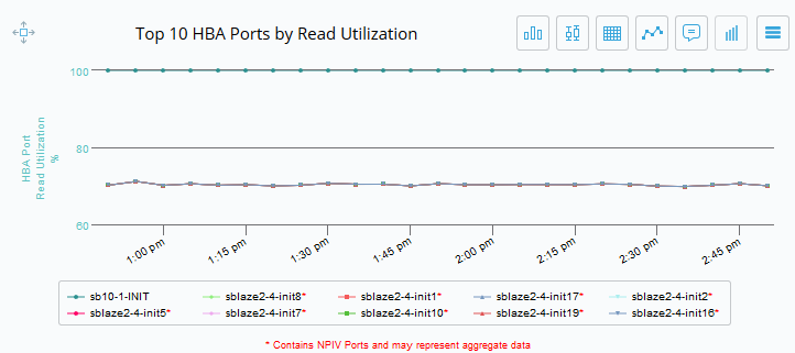
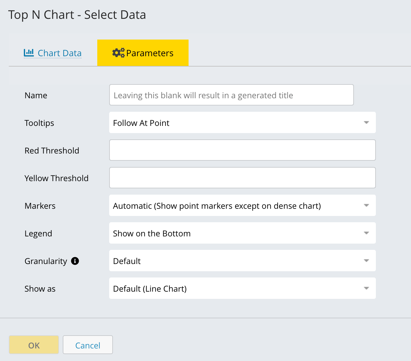
Chart Parameters
You can configure several parameters for any chart type. While every chart offers a feature to automatically name the chart or allow you to specify a custom name, other customizable options exist. These options include setting thresholds, specifying the number of entities (such as showing the top 10), modifying the sort order, incorporating a report variable into the chart name, and selecting the display location for tooltips and legends.
To adjust these parameters, access the Parameters tab within the data selection modal. The example below illustrates a chart type where you can specify a variable for the chart name, select the number of top entities to display, and change the sort order.
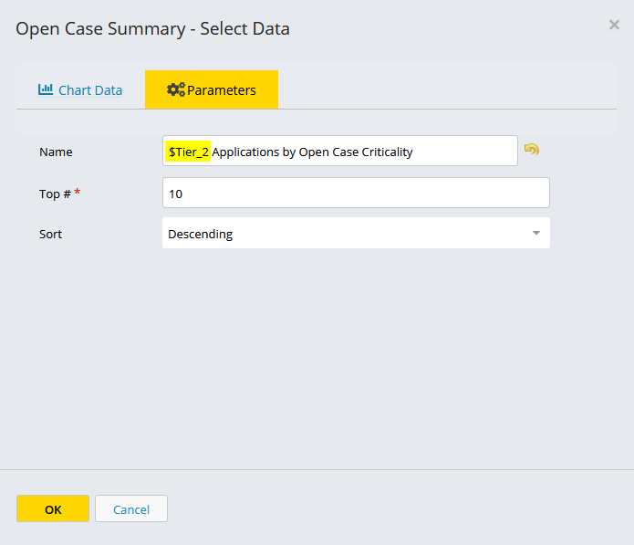
To reset the default chart name, click the back arrow next to the Name field.
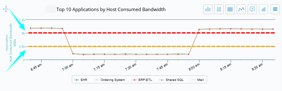
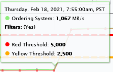
Some chart types, such as Top N Trend, Line Chart, and Inventory Heatmap, allow you to set thresholds that are displayed as yellow and red lines on the chart. In the following example, both red and yellow thresholds are set so you can easily see where the observed data exceeds a user-defined threshold.
The thresholds are displayed on the chart as a yellow and red line.
Important
Threshold lines are inherently unit-less. Their value is interpreted based on the unit of the plotted metric. For example, a threshold set to 10 will represent 10 GB if the metric is in GB, or 10% if the metric is a percentage.
In charts displaying multiple metrics, such as a Line Chart:
Threshold lines are only applied to the first metric listed.
If multiple metrics share the same unit type (for example, two GB metrics), you can use the Linked Axes Mode to make them share a single axis. However, the threshold line will still only apply to the first metric.
Note
A chart's y-axis does not necessarily begin at zero. The minimum and maximum values for the y-axis are automatically scaled based on the metric values within the specified time range. If you define yellow or red threshold lines, the charts will also be auto-scaled to ensure these horizontal lines are included.
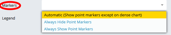
You can also specify where to show point markers automatically or always hide or show point markers.
Specify where to view report tooltips on the chart.
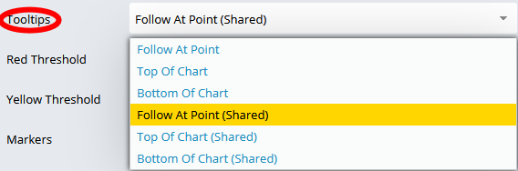
Tooltips appear when you hover over a point in a chart. They show you the value observed for the entity and metric at that point in time.
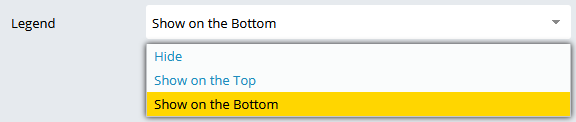
You can also select to show or hide the legend, and where you want the legend to appear in the chart.
Granularity
Granularity controls the time resolution at which data is aggregated and displayed. This setting determines how detailed or summarized the chart appears across the selected timeframe.
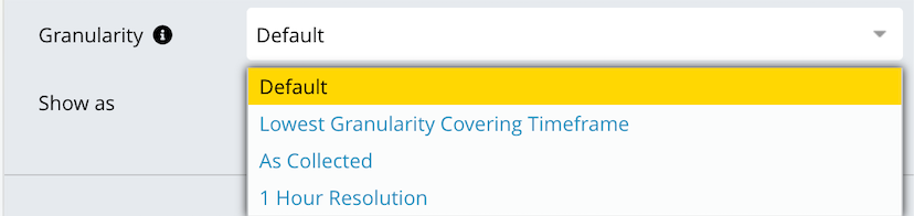
Choose a granularity option based on how much detail you want to see and the length of the selected time range.
Default: Uses the system-recommended granularity.
Lowest Granularity Covering Timeframe: Uses the lowest (coarsest) granularity that still covers the selected timeframe.
As Collected: Shows data exactly as it was collected, with no aggregation.
1 Hour Resolution: Aggregates data into 1-hour intervals. Helps identify hourly trends.
Show as:
The Show As option lets you choose how data is visually displayed in the chart. Selecting the correct chart type helps you better understand trends, comparisons, and distributions.
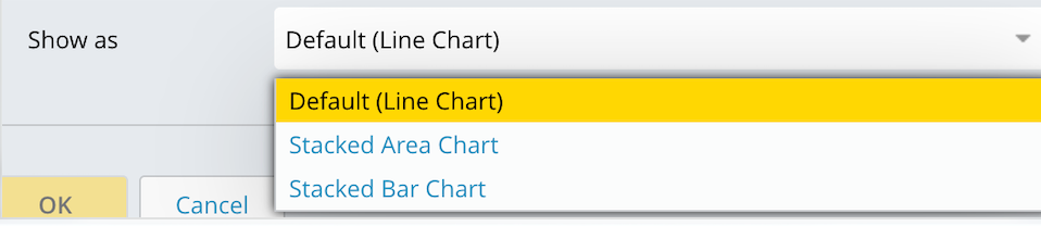
Default (Line Chart): Displays data as a line over time. Line charts make it easy to spot spikes, drops, and overall performance trends.
Stacked Area Chart: Displays data as stacked areas, showing how individual components contribute to the total over time. It highlights both total growth and the relative contribution of each component.
Stacked Bar Chart : Displays data as stacked bars for each time interval. Stacked bars make it easier to compare contributions across time slices without focusing on continuous trends.